We know how much effort you put in building the right content of your mobile application. That will impart a sense of brand value in your viewer perception and experience.
However, all your work and energy may go in vain if your vision is not delivered to your customers because of disturbing content layout and alignment.
These nuances that make customer disconnected and most likely to lose attention while in a few seconds of browsing your mobile application because of improper mobile device compatibility.
Why Choose Tablet and Mobile Supported Applications?
More than of a choice its now a standard practice to build applications that provide tablet as well as mobile support. Initially more no of people used laptop and desktop services in order to access websites.
As of now with increasing internet penetration the scenario has completely changed more number of people are using different variants of devices which includes different types of screen sizes.
In order to retain your customers, you have to provide them with your content in a manner that no users have to go through such trouble of alignment and improper layout of content in viewing and accessing your application even if they are using different sets of devices.

What is Mobile Device Compatibility?
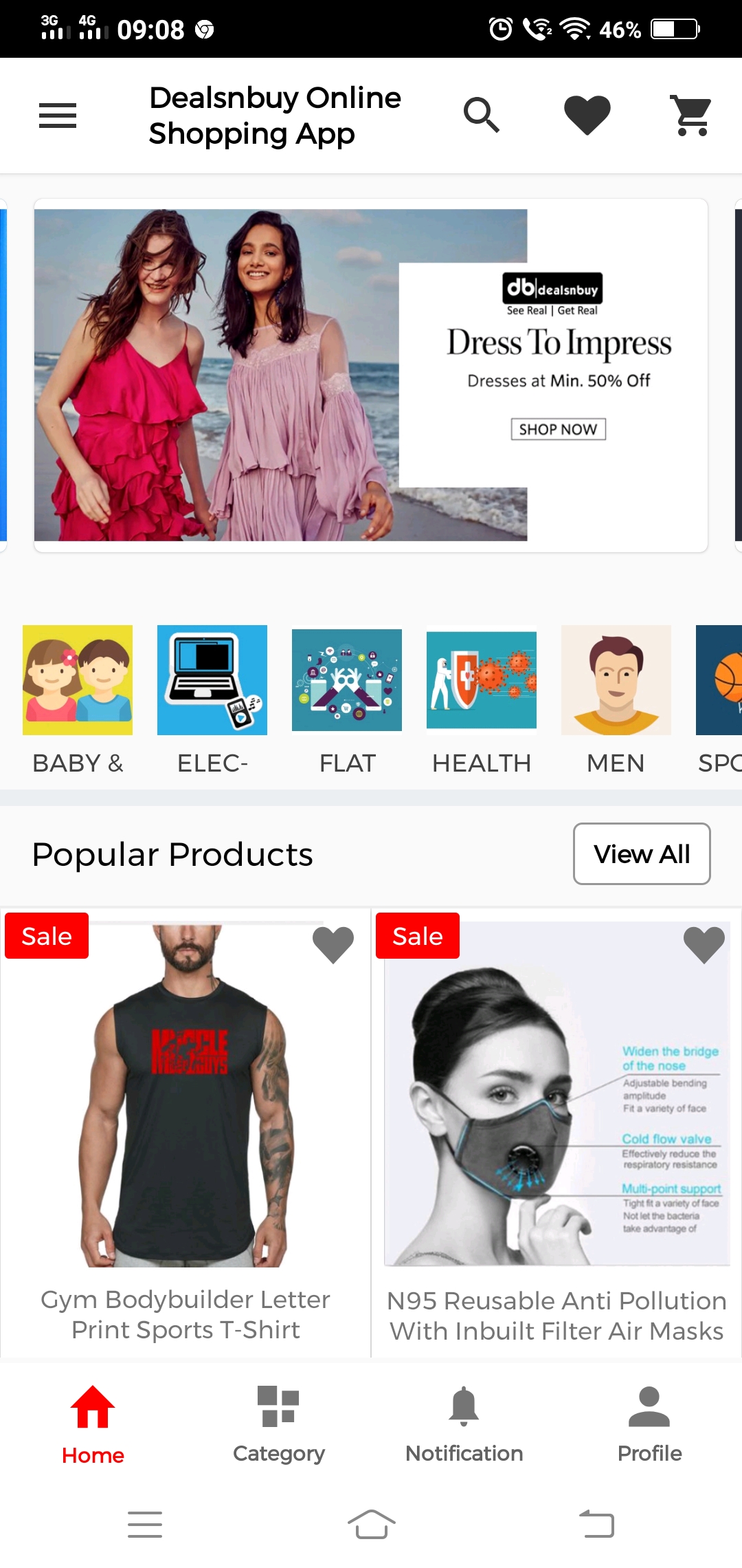
For any application to work properly across multiple devices without any probable issues of content alignment while viewing its content is called mobile device compatibility.
Now there are two terms which are often confused with each other Mobile compatible and Mobile optimized. In reality, these are completely two different characteristics and you may have encountered with various examples of such applications.
Mobile Compatible
Majority of your customers almost more than 60% tend to leave your application if you have a mobile compatible website.
As these are specifically designed for web browser and PCs with much larger screen space. In which case a user can view a mobile compatible website but faces critical issues while accessing it. Some of which are mentioned below:
- Difficulty in the navigation of the content.
- Smaller texts making users magnify content by pinching and zooming back and forth.
- Never fits with Mobile device screen ration.
- Large visuals and no alignment as a result users have to scroll the page a lot.
- Small tabs and buttons which are not user friendly at all. Therefore the only way to access these is constant pinching and zooming the content.
- Users need to scroll indefinitely and often misses out on various information.
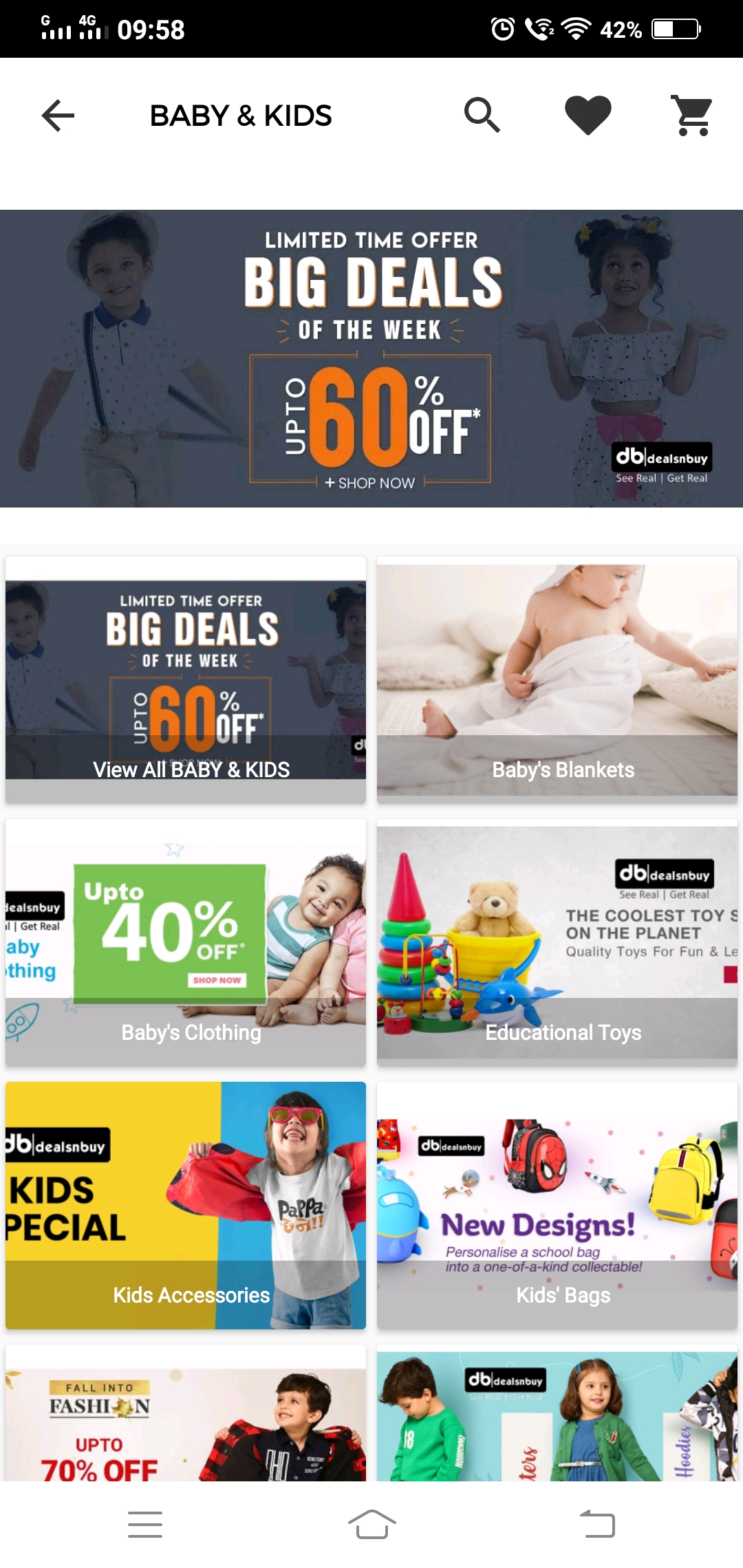
Mobile-Optimized
These are the websites that are designed to run on both tablets and smartphones. Which is very user friendly as the buttons and tabs are large enough to be accessed and the complete content fits well with the Mobile device screen dimensions.
You will see a prominent increase in customer retention. Including average time a user spends on your website is also enhanced. since these are way easier to navigate as shown below.
- Fits precisely with screen dimensions.
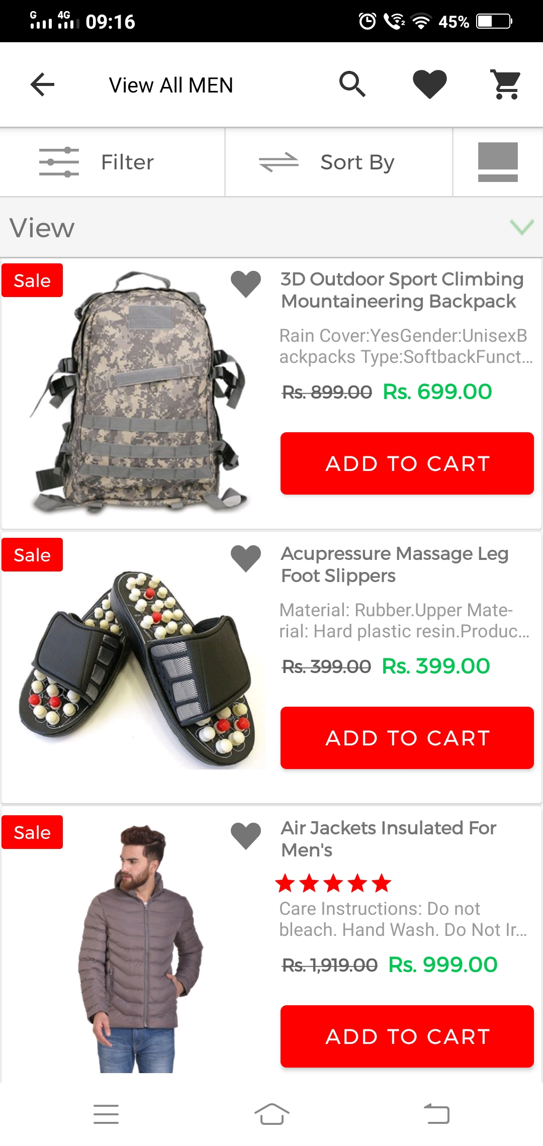
- Texts size with optimum readability in mobile and tablet view both.
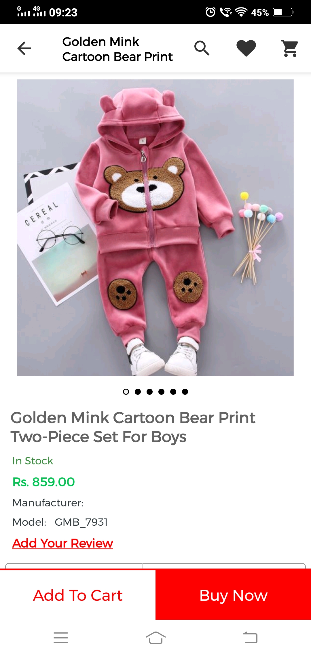
- Proper alignment with easy swipe and view.

What kind of design do you need in your Applications?
A good UI/UX design in your application with a good screenspace optimization is indeed very important for a better user experience.
As the design is the first point of contact with your customers and an ideal user interface design should support all kinds of devices with different screen sizes.
Moreover, your customers may use a spectrum of types of devices including varying sizes of smartphones models with tablets, as a result, a specific design that fits the combination of all of these devices isn’t possible.
So the question is what kind of design will be entirely suitable for your app. In order to understand this let’s check out the types of design and how they function.
Responsive Design
Now, with the continuous advancements in the handheld device and their screen designs from Apple series to Samsung notes and now split-screen options as well.
It is practically not conceivable and feasible to create a design that fits with all the devices neither different versions for all the available mobile devices.
That is why Responsive web designs are used as these works as a custom solution for a wide number of device variants. Responsive Web design is the method in which design and development modify with the user’s device operation and screen size.
The responsive design utilizes a mix of flexible grids and layouts, images and optimum use of CSS media queries. As the user switches from one device to another the website accommodate on its own for the resolution, image size and scripting abilities.
Below are the mentioned reasons why one should build an application using a responsive design.
- Responsive design is flexible with image resolution.
- Recognize the screen size and accommodates itself.
- It doesn’t require identifying the browser and device model in order to reckon out how to reproduce the content across the different device.
- Responsive design is quick to load and doesn’t result in any glitches.
- Responsive design is dynamic and uses a single layout.
Adaptive design
The Adaptive design refers to the graphical user interface design that adapts to different screen sizes. Adaptive design typically uses various fixed layout sizes.
When the system identifies the browser size, in accordance with which it also selects the layout which is the most appropriate fit for the screen. Commonly used layouts of an adaptive design are 320, 480, 760, 960, 1200, and 1600 pixels.
Below are the mentioned reasons why one should build an application using an adaptive design.
- The adaptive design adapts to different screen sizes.
- The content supports a fixed layout size in adaptive design.
- Adaptive design uses a few fixed layouts and then picks the most appropriate layout for the current screen size.
- The adaptive design is non-dynamic and tailor-made.
Benefits of Having a tablet and mobile supported App
In conclusion, you can’t control the type of device that people may use to access your application. However, you can definitely create applications that best optimize the screen size and adapt.
Applications that are capable of working on any device from small-screen smartphones to tablets and many more as such if they are designed well. Below are the few advantages of a tablet and mobile supported application.
- Provides extremely good optimized content with adaptive design.
- More no of users with different device variants can access the application.
- Cost-effective solution and at the same time enhance user experience.
- Bounce rate is more likely to drop and eventually, customer spend more time browsing your application.
Note –
You can download and use our demo versions in both the mobile and tablet for Android as well as for iOS
Support
If you have any query or suggestion. Do let us know at [email protected].
Moreover, If you already have the account on the ticket system then please Sign In the system. Raise your requirements regarding the customization of this feature.

Be the first to comment.