Material is an adaptable system of guidelines, components, and tools that support the best practices of user interface design. Backed by open-source code. Material streamlines collaboration between designers and developers and helps teams quickly build beautiful products.
As per Google documentation, Material design is a guide for visual, motion, and interaction design. The Android platform provides a new theme, new widgets, and new API for custom shadows and animations. Material design also provides improved API for animations and provides several default animations.
Android provides the following features to help you build material design apps:
- A material design app theme to style all your UI widgets
- Widgets for complex views such as lists and cards
- New APIs for custom shadows and animations
So, if you’ve migrated your Android app to AndroidX and, in the process, have also switched to using Material Components for Android as opposed to the Design Support Library, the core widgets you incorporate into your app now mostly fall under the com.google.android.material package and bring with them a variety of new theme/style attributes.
So, in this blog, we will be learning new global theme attributes and per-widget style attributes that are introduced. Given that the Theme.MaterialComponents themes extend the pre-existing Theme.AppCompat variants, they inherit all of their attributes (think colorAccent, colorControlNormal, etc.), which will not be covered.
Difference between styles and themes
Styles and themes on Android allow you to separate the details of your app design from the UI structure and behavior, similar to stylesheets in web design.
The biggest reason why everyone gets confused between styles and themes is that for styles we have one tag named <style> but there is nothing called <theme> tag in Android. Following are the differences between these two:
A style is a collection of attributes that specify the appearance for a single View. A style can specify attributes such as font color, font size, background color, and much more.
For example, one style might specify a button’s attributes. Every attribute you specify in a style is an attribute you could set in the layout file. By extracting all the attributes to a style, it’s easy to use and maintain them across multiple widgets
A theme is a collection of attributes that are applied to an entire app, activity, or view hierarchy—not just an individual view. When you apply a theme, every view in the app or activity applies each of the theme’s attributes that it supports. Themes can also apply styles to non-view elements, such as the status bar and window background.
You can think of styles as a map because it has a key and its value. So, we have view attributes and for that view attributes, we have some values associated with it in a style. While in theme, we have theme attributes and values.
Styles and themes are declared in a style resource file in res/values/, usually named styles.xml.
Create and apply a style
- Add a <style> element with a name that uniquely identifies the style.
- Add an <item> element for each style attribute you want to define.
The name in each item specifies an attribute you would otherwise use as an XML attribute in your layout. The value in the <item> element is the value for that attribute.
For example, if you define the following style:
|
1 2 3 4 5 6 |
<?xml version="1.0" encoding="utf-8"?> <resources> <style name="GreenText" parent="TextAppearance.AppCompat"> <item name="android:textColor">#00FF00</item> </style> </resources> |
You can apply the style to a view as follows:
|
1 2 3 |
<TextView style="@style/GreenText" ... /> |
Each attribute specified in the style is applied to that view if the view accepts it. The view simply ignores any attributes that it does not accept.
Apply a style as a theme
You can create a theme the same way you create styles. The difference is how you apply it: instead of applying a style with the style attribute on a view, you apply a theme with the android:theme attribute on either the <application> tag or a <activity> tag in the AndroidManifest.xml file.
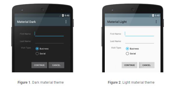
For example, here’s how to apply the Android Support Library’s material design “dark” theme to the whole app:
|
1 2 3 4 |
<manifest ... > <application android:theme="@style/Theme.AppCompat" ... > </application> </manifest> |
And here’s how to apply the “light” theme to just one activity:
|
1 2 3 4 5 6 |
<manifest ... > <application ... > <activity android:theme="@style/Theme.AppCompat.Light" ... > </activity> </application> </manifest> |
Material Theming
So, we have seen the difference between styles and themes. Now its time to learn Material Theming.
Material Theming is used to provide a new look and feel to your application by using Material Design. You can achieve a huge range of expressiveness in your application by using Material Theming.
Android platform provides two material themes, one in the dark and the second one is light
- Theme.Material
- Theme.Material.Light
There are several variants of the above material themes, listed below.
- Theme.Material.NoActionBar
- Theme.Material.NoActionBar.Fullscreen
- Theme.Material.NoActionBar.Overscan
- Theme.Material.NoActionBar.TranslucentDecor
- Theme.Material.Light.DarkActionBar
- Theme.Material.Light.NoActionBar.Fullscreen
- Theme.Material.Light.NoActionBar.Overscan
- Theme.Material.Light.NoActionBar.TranslucentDecor
Using the Material Theme
The material theme is defined as:
- @android:style/Theme.Material (dark version)
- @android:style/Theme.Material.Light (light version)
- @android:style/Theme.Material.Light.DarkActionBar
You can apply a material theme to an application or activity by setting the theme attribute of application and activity elements in the android manifest file.
|
1 2 3 4 |
<application android:theme="@android:style/Theme.Material.Light" . . . > </application> |
The Material Components themes have a number of attributes that are used to style an element on a global scale. All the attributes can be broadly divided into three categories:
- Color
- Typography
- Shape
Just by providing the values to all the above three mentioned categories, you can achieve a huge range of quality design in your application.
Color
You can change the theme color for text color, status bar, action bar, navigation bar, window background, and UI controls using textColorPrimary, colorPrimaryDark, colorPrimary, navigationBarColor, windowBackground and colorAccent properties.
|
1 2 3 4 5 6 7 8 9 10 |
<resources> <style name="AppTheme" parent="@android:style/Theme.Material.Light"> <item name="android:colorPrimary">#673ab7</item> <item name="android:colorPrimaryDark">#1a237e</item> <item name="android:colorAccent">#f44336</item> <item name="android:textColorPrimary">#1b5e20</item> <item name="android:textColor">#0091ea</item> <item name="android:windowBackground">@color/colorBackground</item> </style> </resources> |
Material Dialog Themes
Material themes include themes for dialog and overlays.
Below are the material dialog and overlay themes and variants of these themes are also available.
- Theme_Material_Dialog
- Theme_Material_Dialog_Presentation
- Theme_Material_Light_Dialog
- ThemeOverlay_Material_Dialog
- ThemeOverlay_Material_Light
- ThemeOverlay_Material_Dark
- ThemeOverlay_Material
If you want to change the default dialog theme of the material theme applied to the application, you can use alertDialogTheme and dialog theme attribute as shown below.
|
1 2 3 4 5 6 |
<style name="AppTheme" parent="@android:style/Theme.Material.Light"> <item name="android:colorPrimary">#673ab7</item> . . . <item name="android:alertDialogTheme">@android:style/Theme.Material.Dialog.Presentation</item> <item name="android:dialogTheme">@android:style/Theme.Material.Dialog.Presentation</item> </style> |
Material Styles for Text
Below are some of the material text styles applying the styles to TextView with textAppearance attribute.
- TextAppearance.Material.Body1
- TextAppearance.Material.Body2
- TextAppearance.Material.Inverse
- TextAppearance.Material.Small
- TextAppearance.Material.Medium
- TextAppearance.Material.Large
- TextAppearance.Material.Headline
- TextAppearance.Material.Title
- TextAppearance.Material.Display1
- TextAppearance.Material.Display2
Widget Materials Themes
If you want particular widgets on a screen to have a different look, you can use theme attribute to apply different themes to it or change specific styling attributes to get the required look and feel.
Material Themes Compatibility
Since material themes were introduced in Android 5.0, you need to take care of compatibility issue so that application, which is using material themes, run on prior Android versions.
One way to take care of compatibility is to define separate styles for different versions of android and keep them in corresponding res/values folder. This approach is the right choice if you want a material design for your app only when it runs on Android 5.0 and later versions and non-material themes when it runs on versions prior to Android 5.0. For example, two versions of the style file with the same custom theme name are defined and placed in res/values and res/values-21 folders. You can apply the custom theme to the application in the manifest. Android will pick the style based on its version on the device.
Custom style inheriting material theme that needs to be placed res/values-21 folder.
|
1 2 3 4 5 6 |
<resources> <style name="AppTheme" parent="@android:style/Theme.Material.Light"> <item name="android:colorPrimary">#673ab7</item> . . . </style> </resources> |
Custom style inheriting holo theme that needs to be saved in res/values folder.
|
1 2 3 4 5 |
<resources> <style name="AppTheme" parent="@android:style/Theme.Holo.Light"> . . . </style> </resources> |
Using App Compact Material Themes
If you want material themes in all the versions of Android, you can use app compact material themes from support library. App compact material themes are material themes that are part of the support library and can provide material design for apps running on older android versions.
To use app compact material themes, make sure that the app compact library, for example, com.android.support:appcompat-v7:26.0.1, is added to your project.

2 comments