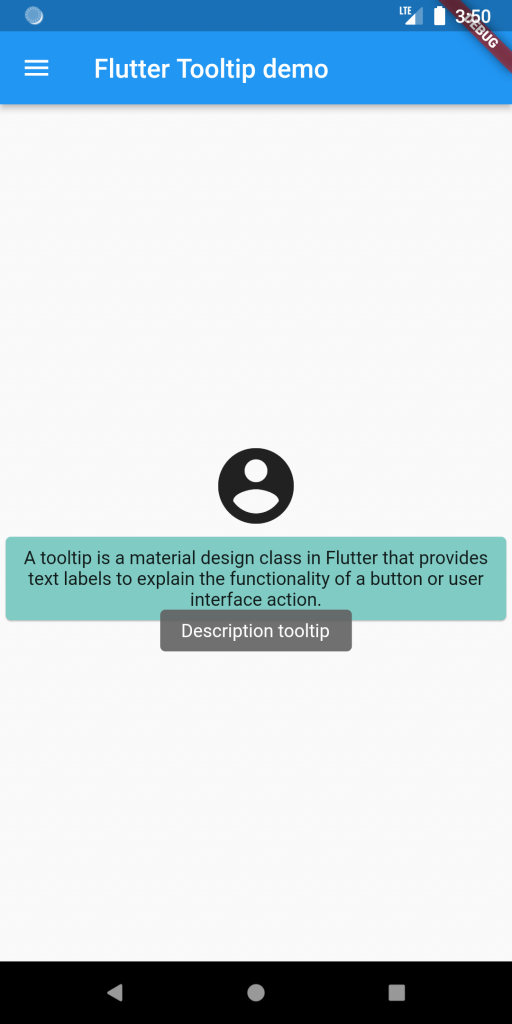
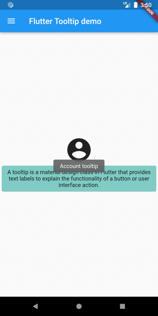
Tooltip explains the functionality of an icon or user interface action with the help of a text label and helps us to explain the features of an app in a better way. The tooltip in Flutter is very easy to use.
When a user moves or points over a particular widget, it shows additional information. As a result, it increases the accessibility of an application. The use case of the tooltip is when you have a lot of information to show on the screen but the UI of the application is too thick to show all data at once. In that case, you can just wrap your widgets with a Tooltip, and when you long press or hover over the widget, a Tooltip will show information about the widget. It makes the application more open.
You may also check our Flutter app development company page.
Properties of tooltip:
message ~> It is the text to display in the tooltip. It cannot be null if the rich message is null.
child ~> child is the widget that needs to show a Tooltip.
height ~> This property specifies the height of the tooltip. It takes a double value.
decoration ~> decoration property controls the background color and shape of the tooltip.
padding~> padding determines the space between the border and the main content of the Tooltip.
showDuration ~> showDuration determines the time in seconds for which the tooltip should be displayed.
textStyle ~> This property is used to take care of the styling of the message in the tooltip such as font size or color.
verticalOffset ~> This property is utilized to control the vertical distance between the tooltip and the widget.
waitDuration ~> Controls the time after which the tooltip will be made apparent once the user floats over the widget of presses it for over one second.
Implementation:
Create a new project and use some widgets to build a simple UI.
|
1 2 3 4 5 6 7 8 9 10 11 12 13 14 15 16 17 18 19 20 21 22 23 24 25 |
Scaffold( appBar: AppBar( leading: Icon(Icons.menu), title: Text(widget.title), ), body: Center( child: Column( crossAxisAlignment: CrossAxisAlignment.center, mainAxisAlignment: MainAxisAlignment.center, children: [ const Icon( Icons.account_circle, size:70, ), Card( color: Colors.teal.shade200, child: const Padding( padding: EdgeInsets.all(8.0), child: Text("A tooltip is a material design class in Flutter that provides text labels to explain the functionality of a button or user interface action.", textAlign: TextAlign.center,), ), ) ], ) ) ); |
Now wrap your icon and text widgets with a tooltip and add a message.
|
1 2 3 4 |
leading: const Tooltip( message: "Menu", child: Icon(Icons.menu), ), |
|
1 2 3 4 5 |
const Tooltip( message: "Account tooltip", child: Icon( Icons.account_circle, size:70, ), |
|
1 2 3 4 5 6 7 8 9 10 11 |
Tooltip( message: "Description tooltip", child: Card( color: Colors.teal.shade200, child: const Padding( padding: EdgeInsets.all(8.0), child: Text("A tooltip is a material design class in Flutter that provides text labels to explain the functionality of a button or user interface action.", textAlign: TextAlign.center,), ), ), |
Full code:
|
1 2 3 4 5 6 7 8 9 10 11 12 13 14 15 16 17 18 19 20 21 22 23 24 25 26 27 28 29 30 31 32 33 34 35 36 37 38 39 40 41 42 43 44 45 46 47 48 49 50 |
class MyHomePage extends StatefulWidget { const MyHomePage({Key? key, required this.title}) : super(key: key); final String title; @override State<MyHomePage> createState() => _MyHomePageState(); } class _MyHomePageState extends State<MyHomePage> { @override Widget build(BuildContext context) { return Scaffold( appBar: AppBar( leading: const Tooltip( message: "Menu", child: Icon(Icons.menu), ), title: Text(widget.title), ), body: Center( child: Column( crossAxisAlignment: CrossAxisAlignment.center, mainAxisAlignment: MainAxisAlignment.center, children: [ const Tooltip( message: "Account tooltip", child: Icon( Icons.account_circle, size:70, ), ), Tooltip( message: "Description tooltip", child: Card( color: Colors.teal.shade200, child: const Padding( padding: EdgeInsets.all(8.0), child: Text("A tooltip is a material design class in Flutter that provides text labels to explain the functionality of a button or user interface action.", textAlign: TextAlign.center,), ), ), ) ], ) ) ); } } |
Output:


Conclusion:
This is how we add Tooltips in Flutter. You can use more of its properties.
Thanks for reading this article.
If I got something wrong, let me know in the comments. I would love to improve.
You can also read – https://mobikul.com/get-storage-in-flutter/
Reference link: https://api.flutter.dev/flutter/material/Tooltip-class.html

Be the first to comment.