In today’s blog we are going to discuss how to create custom checkbox tile in flutter. If you are using flutter then you may probably know that it provide CheckboxListTile widget for this purpose.

CheckboxListTile displays a title, subtitle, and checkbox horizontally but lacks options to customize the checkbox’s size, shape, and icon.
We can create our own Custom checkbox tile and customize size, shape and the check icon based on our need.
You may also check our flutter app development services page to read more about Flutter app development from mobikul.
Implementation
To implement custom list tile in flutter follow these steps mention below :
STEP 1
Create a custom check box stateful class (CustomCheckBox) as shown below :
|
1 2 3 4 5 6 7 8 9 10 11 12 13 14 15 16 17 18 19 20 21 22 23 24 25 26 27 28 29 30 31 32 33 34 35 36 37 38 39 40 41 42 43 44 45 46 47 48 49 50 51 52 53 54 55 56 57 58 59 60 61 62 63 64 65 66 67 68 69 70 71 72 73 74 75 76 77 78 79 80 81 82 83 84 85 86 87 88 89 90 91 92 93 94 95 96 97 98 99 100 101 102 103 104 105 106 107 108 109 110 111 112 113 114 115 |
class CustomCheckBox extends StatefulWidget { const CustomCheckBox({ Key? key, this.size = 25, this.type = MyCheckboxType.none, this.activeBgColor = Colors.lightBlue, this.inactiveBgColor = Colors.white, this.activeBorderColor = Colors.white, this.inactiveBorderColor = Colors.black, required this.onChanged, required this.value, this.activeIcon, this.inactiveIcon, this.customBgColor = Colors.lightGreenAccent, this.autofocus = false, this.focusNode, this.checkColor = Colors.white }) : super(key: key); final MyCheckboxType type; final double size; final Color activeBgColor; final Color inactiveBgColor; final Color activeBorderColor; final Color inactiveBorderColor; final ValueChanged<bool>? onChanged; final bool value; final Widget? activeIcon; final Widget? inactiveIcon; final Color customBgColor; final bool autofocus; final FocusNode? focusNode; final Color? checkColor; @override State<CustomCheckBox> createState() => _CustomCheckBoxState(); } class _CustomCheckBoxState extends State<CustomCheckBox> { bool get isEnabled => widget.onChanged != null; @override Widget build(BuildContext context) => Column( crossAxisAlignment: CrossAxisAlignment.start, mainAxisAlignment: MainAxisAlignment.start, children: [ FocusableActionDetector( focusNode: widget.focusNode, autofocus: widget.autofocus, enabled: isEnabled, child: InkResponse( highlightShape: widget.type == MyCheckboxType.circle ? BoxShape.circle : BoxShape.rectangle, containedInkWell: widget.type != MyCheckboxType.circle, canRequestFocus: isEnabled, onTap: widget.onChanged != null ? () { widget.onChanged!(!widget.value); } : null, child: Container( height: widget.size, width: widget.size, margin: widget.type != MyCheckboxType.circle ? const EdgeInsets.all(10) : EdgeInsets.zero, decoration: BoxDecoration( color: isEnabled ? widget.value ? widget.type == MyCheckboxType.custom ? Colors.white : widget.activeBgColor : widget.inactiveBgColor : Colors.grey, borderRadius: widget.type == MyCheckboxType.none ? BorderRadius.circular(3) : widget.type == MyCheckboxType.circle ? BorderRadius.circular(50) : BorderRadius.zero, border: Border.all( color: widget.value ? widget.type == MyCheckboxType.custom ? Colors.black87 : widget.activeBorderColor : widget.inactiveBorderColor)), child: widget.value ? widget.type == MyCheckboxType.custom ? Stack( children: [ Container( alignment: Alignment.center, ), Container( margin: const EdgeInsets.all(5), alignment: Alignment.center, width: widget.size * 0.8, height: widget.size * 0.8, decoration: BoxDecoration( shape: BoxShape.rectangle, color: widget.customBgColor), ) ], ) : widget.activeIcon ?? Icon( Icons.check, size: 20, color: widget.checkColor, ) : widget.inactiveIcon, ), ), ), ]); } |
In above code we have created stateful widget and accepting customizable properties in the the constructor of the widget from the its parent widget.
These customizable properties includes : size, shape, check widget, active colour, background colour etc.
You can also check this link.
STEP 2
Then create enum (MyCheckboxType) to define checkbox types (circle, square, custom and none) as shown below :
|
1 |
enum MyCheckboxType {circle, square, custom, none} |
STEP 3
Now we can use this custom check box as a widget, To use this custom widget create a Stateful widget (CustomCheckBoxTile) and import the custom checkbox tile.
|
1 2 3 4 5 6 7 8 9 10 11 12 13 14 15 16 17 18 19 20 21 22 23 24 25 26 27 28 |
class CustomCheckBoxTile extends StatefulWidget { const CustomCheckBoxTile({Key? key}) : super(key: key); @override State<CustomCheckBoxTile> createState() => _StateCustomCheckBoxTile(); } class _StateCustomCheckBoxTile extends State<CustomCheckBoxTile> { bool accepted = false; @override Widget build(BuildContext context) { return Scaffold( appBar: AppBar( title: const Text("Custom checkbox tile"), ), body: Column( children: [ CustomCheckBox(value: accepted, onChanged: (val){ setState(() { accepted = val ?? false; }); },size: 30) ], ), ); } } |
In above example code we have created a boolean variable “accepted” to check and uncheck the checkbox.
- We have used CustomCheckBox widget which we have created earlier and passed accepted variable in value property.
- in onChanged property we have passed callback function to update the boolean variable and update the UI using setState method.
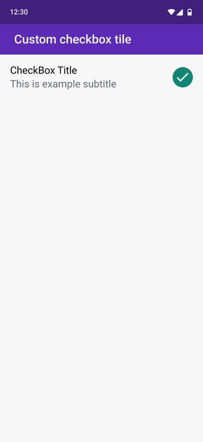
Output
Run the project to check the output for our code, we will get the output as shown below :
Custom Checkbox Tile
Create custom Checkbox tile
Now we can create our custom checkbox tile using the flutter List tile widget and our CustomCheckBox widget as shown below :
|
1 2 3 4 5 6 7 8 9 10 11 12 13 14 15 16 17 18 19 20 21 22 23 24 25 26 |
@override Widget build(BuildContext context) { return Scaffold( appBar: AppBar( title: const Text("Custom checkbox tile"), ), body: Column( children: [ ListTile( titleAlignment: ListTileTitleAlignment.top, leading: CustomCheckBox( value: accepted, activeBgColor: Colors.teal, onChanged: (val) { setState(() { accepted = val; }); }, size: 30), title: const Text("CheckBox Title"), subtitle: const Text("This is exmaple subtitle"), ), ], ), ); } |
In above example code we have used flutter’s ListTile widget inside column children as :
- In the leading property of the list tile we have used CustomCheckBox widget.
- The title and subtitle properties we have used for example text.
- when the check box value is changed the UI is updated.
want to learn more about multi select check box.
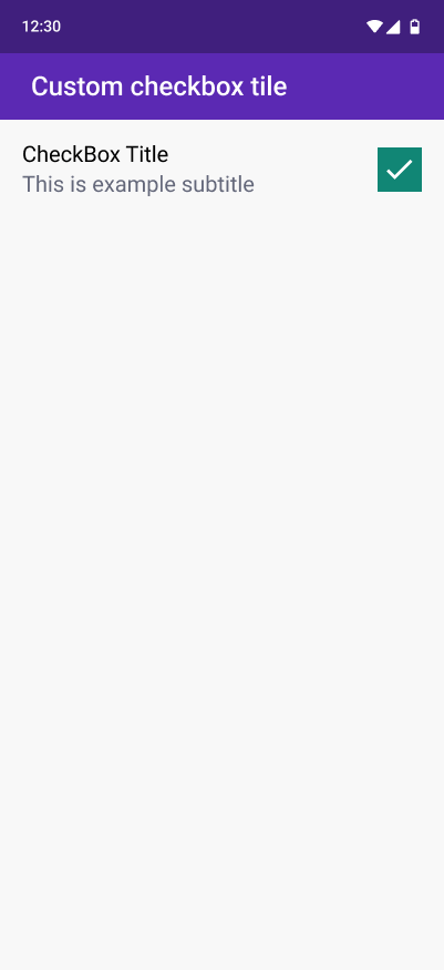
Output of example code
Output Of Example Code
Trailing checkbox with circle shape
|
1 2 3 4 5 6 7 8 9 10 11 12 13 14 |
ListTile( trailing: CustomCheckBox( value: accepted, type: MyCheckboxType.circle, activeBgColor: Colors.teal, onChanged: (val) { setState(() { accepted = val; }); }, size: 35), title: const Text("CheckBox Title"), subtitle: const Text("This is exmaple subtitle"), ), |
- In above example we have used checkbox widget as trailing property in ListTile.
- The shape of the checkbox in circle (MyCheckboxType.circle)
We get the circular checkbox output :
Checkbox Type: Circular
Checkbox with Custom check widget
|
1 2 3 4 5 6 7 8 9 10 11 12 13 14 15 |
ListTile( trailing: CustomCheckBox( value: accepted, type: MyCheckboxType.none, activeIcon: Icon(Icons.done_all), activeBgColor: Colors.cyan, onChanged: (val) { setState(() { accepted = val; }); }, size: 35), title: const Text("CheckBox Title"), subtitle: const Text("This is exmaple subtitle"), ) |
To use our custom widget as active check icon widget we need to use activeIcon property and pass your widget, we used (Icons.done_all) in our example code.
We get the output as :
Checkbox Type: None
Conclusion
Thanks for reading this article ❤️
I hope this blog will help you to learn about how to Custom checkbox tile in flutter and you will be able to implement it.
For more updates, make sure to keep following Mobikul Blogs to learn more about flutter and android.
Happy Learning ✍️
For more understanding about list and list tile go through this link.
References

Be the first to comment.