In this blog, we will learn SliverAppBar-class in Flutter and check how it works.
Looking for the best Flutter app development company?
Introduction
In brief the SliverAppBar class in Flutter is a widget that provides a collapsible app bar for a scrollable list or grid. It is designed to be used with CustomScrollView any other widget that has a scrollable content area.
When a SliverAppBar is created, it occupies the top of the scrollable area and can be collapsed as the user scrolls down. By default, it displays a title, leading and trailing widgets, and a background color.
However, It can be customized to display more complex layouts, such as flexible spaces, tabs, and search fields.
Properties
Some of the important properties of the SliverAppBar class are:
title: A widget to display in the center of the app bar.leading: A widget to display on the left side of the app bar.trailing: A widget to display on the right side of the app bar.flexibleSpace: A widget that appears behind the toolbar and the tab bar, it can be used to add a background image or other flexible content.expandedHeight: The height of the app bar when it is fully expanded.floating: Whether the app bar should become a floating app bar when the user scrolls down.pinned: Whether the app bar should always be visible at the top of the screen.
Example
for example:
|
1 2 3 4 5 6 7 8 9 10 11 12 13 14 15 16 17 18 19 20 21 22 23 24 25 26 27 28 29 30 31 32 33 34 35 36 37 38 39 |
CustomScrollView( slivers: <Widget>[ SliverAppBar( title: Text('My App'), leading: IconButton( icon: Icon(Icons.menu), onPressed: () {}, ), actions: <Widget>[ IconButton( icon: Icon(Icons.search), onPressed: () {}, ), IconButton( icon: Icon(Icons.settings), onPressed: () {}, ), ], expandedHeight: 200.0, flexibleSpace: FlexibleSpaceBar( background: Image.network( '<a href="https://picsum.photos/250?image=9">https://example.com/image.jpg</a>', ///Your image url fit: BoxFit.cover, ), ), ), SliverList( delegate: SliverChildBuilderDelegate( (BuildContext context, int index) { return ListTile( title: Text('Item $index'), ); }, childCount: 50, ), ), ], ); |
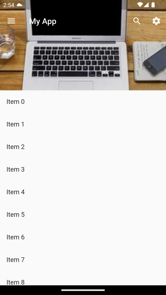
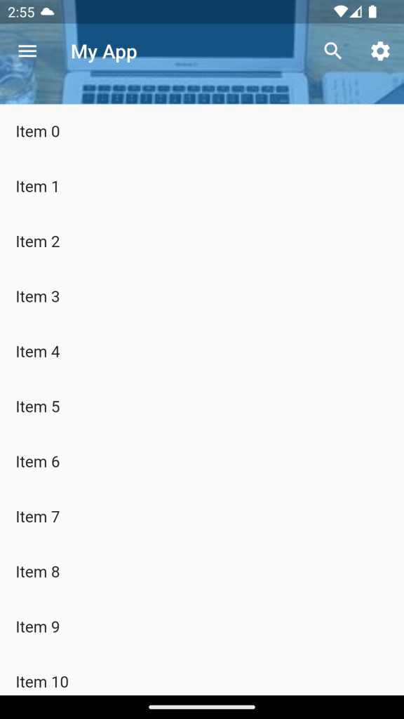
In conclusion to the above example, SliverAppBar has a title, leading and trailing icons, and an expanded height of 200 pixels with the background image.
Just Pass this CustomScrollView to the body of the Scaffold.
Result :
As a result, we will get the below screen.
Conclusion
In this blog, we learn about SliverAppBar-class in flutter. However, you can check more about SliverAppBar-class here.
Thanks for reading…


Be the first to comment.