Flutter is a framework that supports the development of applications for a wide variety of devices just with the help of a single codebase.
The devices could be either a smartwatch, a mobile phone or even Smart TV.
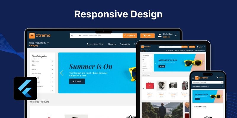
To manage the application’s responsiveness, it is essential to learn & adapt some basic widgets & concepts within Flutter.
Before starting with the blog, if you are looking to develop Mobile Apps, you can check out Flutter development services offered by Mobikul.
Today, in this blog we will be talking about these concepts… Let’s Begin…
- MediaQuery
- OrientationBuilder
- LayoutBuilder
MediaQuery
When we say responsive design, the first thing that a Flutter Developer can think of is MediaQuery.
MediaQuery is used to check various properties of a screen, with the help of it we do not need to declare any static double value to our widgets.
To calculate height: MediaQuery.of(context).size.height
To calculate width: MediaQuery.of(context).size.width
Other than width/height, there are few properties available like devicePixelRatio etc.
|
1 2 3 4 5 6 7 8 |
double screenWidth = mediaQueryData.size.width; double screenHeight = mediaQueryData.size.height; Container( width: screenWidth, height: screenHeight, child: Text('Hello Everyone!'), ); |
Armed with screen size information, we can build layouts that respond seamlessly to different device dimensions.
Imagine conditionally rendering a grid layout with varying numbers of columns based on the available width, or dynamically adjusting font sizes for optimal readability on smaller screens.
OrientationBuilder
OrientationBuilder keeps a check on the parent widget’s orientation and rebuilds the widget tree whenever a change occurs.
It is done by comparing the width and height available to the parent during the layout phase.
|
1 2 3 4 5 6 7 |
OrientationBuilder( builder: (BuildContext context, Orientation orientation) { return orientation == Orientation.portrait ?Container(color:Colors.red) :Container(color:Colors.blue); }, ) |
LayoutBuilder
LayoutBuilder provides access to the constraints imposed by its parent widget. These constraints dictate the maximum width and height of the particular widget rather than the whole screen.
|
1 2 3 4 5 |
LayoutBuilder( builder: (BuildContext context, BoxConstraints constraints) { return Container(); } ) |
Building layouts that change their structure or content based on the available width (e.g., displaying two columns on a wide screen and stacking them vertically on a narrow one).
Conclusion
In this blog, we have discussed in detail some techniques that can be used to make the app design responsive in Flutter.
Read more interesting Flutter Blogs by Mobikul.
Thanks for reading!!
References
https://docs.flutter.dev/ui/layout/responsive/adaptive-responsive

Be the first to comment.