The RangeSlider In Flutter is a customizable widget for selecting a range of values.

In this blog, we are going to learn about the RangeSlider widget in flutter.
The RangeSlider component can offer us a single selection or multiple selections on track.
However,the values are updated by calling set state() within the RangeSlider onChange() callback.
Moreover, in order to have an interactive range slider, the RangeSlider widget must be created within a Stateful widget.
The RangeSlider consists of:
- A track on which we can move across to select the values.
- 2 Knobs indicating the minimum and maximum value of the range.
- and, value indicators that show the labels for the knob values when knobs are defined and
showValueIndicatormatches the type of slider.
Properties of RangeSlider:
- values for a range slider
- minimum value
- maximum value
- labels for a range slider
- inactive color
- active color
Importantly, we will use SliderTheme and then add SliderThemeData. As a result, we will be able to see values displayed above the track.
In these theme data, we will add showValueIndicator, valueIndicatorColor, etc.
Let’s Start The Coding For RangeSlider
Finally here’s the basic code for implementing Range Slider in Flutter-
|
1 2 3 4 5 6 7 8 9 10 11 12 13 14 15 16 17 18 19 20 21 22 23 24 25 26 27 28 29 30 31 32 33 34 35 36 37 38 39 40 41 42 43 44 45 46 47 48 49 50 51 52 53 54 55 56 57 58 59 60 61 62 63 64 65 66 67 68 69 70 71 72 73 74 |
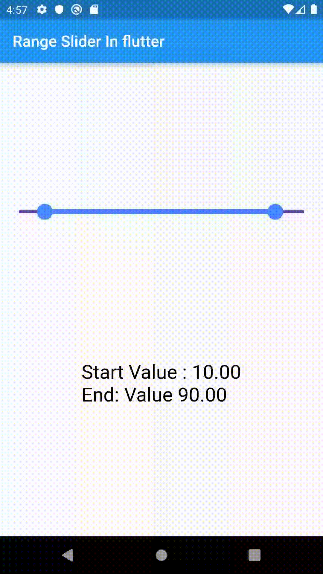
import 'package:flutter/material.dart'; void main() { runApp(const MyApp()); } class MyApp extends StatelessWidget { const MyApp({Key? key}) : super(key: key); @override Widget build(BuildContext context) { return const MaterialApp( debugShowCheckedModeBanner: false, home: MyRangeSlider(), ); } } class MyRangeSlider extends StatefulWidget { const MyRangeSlider({Key? key}) : super(key: key); @override _MyHomePageState createState() => _MyHomePageState(); } class _MyHomePageState extends State<MyRangeSlider> { double start = 10.0; double end = 90.0; @override Widget build(BuildContext context) { return Scaffold( appBar: AppBar( title: const Text("Range Slider In flutter"), ), body: Column( mainAxisAlignment: MainAxisAlignment.spaceEvenly, children: [ SliderTheme( data: const SliderThemeData( overlayColor: Colors.yellow, valueIndicatorColor: Colors.green, showValueIndicator: ShowValueIndicator.always), child: RangeSlider(activeColor: Colors.blueAccent, inactiveColor: Colors.deepPurple, values: RangeValues(start, end), labels: RangeLabels(start.toStringAsFixed(2), end.toStringAsFixed(2)), onChanged: (value) { setState(() { start = value.start; end = value.end; }); }, min: 1.0, max: 100.0, ), ), Text( "Start Value : " + start.toStringAsFixed(2) + "\nEnd: Value " + end.toStringAsFixed(2), style: const TextStyle( fontSize: 25.0, color: Colors.black, fontWeight: FontWeight.normal ), ), ], ), ); } } |
Output
Conclusion
Congratulation!! In this blog, we have implemented RangeSlider Widget.
I hope it will help you out in understanding and getting a brief about it.
Similarly, for more interesting blogs check out here – here
If I got something wrong? Let me know in the comments. I would love to improve.
Clap 👏 If this article helps you.
Thanks for reading!!.
Reference
https://api.flutter.dev/flutter/material/RangeSlider-class.html

Be the first to comment.