Introduction
A material design “Raised Button”. A raised button is based on a Material widget whose Material.elevation increases when the button is pressed.
Use raised buttons to add dimension to otherwise mostly flat layouts, e.g. in long busy lists of content, or in wide spaces. Avoid using raised buttons on already-raised content such as dialogs or cards.
If the onPressed callback is null, then the button will be disabled and by default will resemble a flat button in the disabledColor. If you are trying to change the button’s color and it is not having any effect, check that you are passing a non-null onPressed handler.
Raised buttons have a minimum size of 88.0 by 36.0 which can be overridden with ButtonTheme.
Properties:
There are some properties that are used to declare the following:
- color — This is the color used for the background color of the button while it is in it’s default, unpressed state.
- disabledColor — This is the color used for the button when it is in it’s disabled state.
- disabledElevation — This is the float value used for the elevation of the button when it is in it’s disabled state.
- elevation — This is the float value used for the elevation of the button when it is in it’s default state.
- enabled — This declares whether or not the button is currently enabled.
- highlightColor — This is the secondary color of the button when it is in a pressed state.
- highlightElevation — This is the float value used for the elevation of the button when it is in a pressed state.
- onPressed — This is the callback used to receive events when the button is pressed.
- splashColor — This is the primary color used for the button when it is in a pressed state.
The RaisedButton element needs to be used under the MaterialApp, so you will create the MaterialApp and then push the RaisedButton element to the MaterialApp’s home property.
Example:
Below is the code that describes how it works.
|
1 2 3 4 5 6 7 8 9 10 11 12 13 14 15 16 17 18 19 20 21 22 23 24 25 26 27 28 29 30 31 32 33 34 35 36 37 38 39 40 41 42 43 44 45 46 |
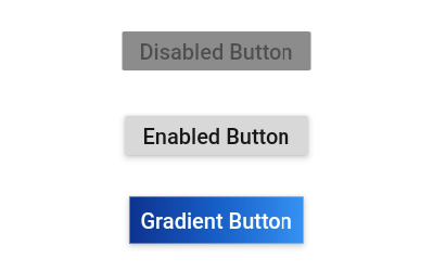
Widget build(BuildContext context) { return Center( child: Column( mainAxisSize: MainAxisSize.min, children: <Widget>[ const RaisedButton( onPressed: null, child: Text( 'Disabled Button', style: TextStyle(fontSize: 20) ), ), const SizedBox(height: 30), RaisedButton( onPressed: () {}, child: const Text( 'Enabled Button', style: TextStyle(fontSize: 20) ), ), const SizedBox(height: 30), RaisedButton( onPressed: () {}, textColor: Colors.white, padding: const EdgeInsets.all(0.0), child: Container( decoration: const BoxDecoration( gradient: LinearGradient( colors: <Color>[ Color(0xFF0D47A1), Color(0xFF1976D2), Color(0xFF42A5F5), ], ), ), padding: const EdgeInsets.all(10.0), child: const Text( 'Gradient Button', style: TextStyle(fontSize: 20) ), ), ), ], ), ); } |
Result:
The above code gives the below result which is showing in the image-
Thank You!!!

Be the first to comment.