Introduction
It is mostly use to present the data in graph When categorical data needs to be shown in percentages, PieChart (a.k.a circle charts) will be a good choice. Each chart always represents the whole, thus, must be equal to 100%
Using charts to display data can help users understand the information more easily than they would if it were presented in a table, especially when dealing with a lot of data. With charts, you can easily see patterns in the data at a glance as opposed to reading through a whole table (or several tables) to get this information. The use of charts has been a common feature in business and fitness apps..
Let’s Start with the code for PieChart
- Please install the pod with the below code
|
1 |
pod 'PieCharts' |
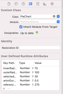
2. Add a view in the storyboard and add the class of PieChart, Configurable in interface builder, with live update of the view:
3. Import the library for PieChart in your view controller where you want to add the PieChart
|
1 |
import PieCharts |
4. Make and outlet for pie chart and add the color array
|
1 2 3 4 5 6 7 8 9 10 11 12 13 14 15 16 |
@IBOutlet weak var chartView: PieChart! fileprivate static let alpha: CGFloat = 0.5 let colors = [ UIColor.yellow.withAlphaComponent(alpha), UIColor.green.withAlphaComponent(alpha), UIColor.purple.withAlphaComponent(alpha), UIColor.cyan.withAlphaComponent(alpha), UIColor.darkGray.withAlphaComponent(alpha), UIColor.red.withAlphaComponent(alpha), UIColor.magenta.withAlphaComponent(alpha), UIColor.orange.withAlphaComponent(alpha), UIColor.brown.withAlphaComponent(alpha), UIColor.lightGray.withAlphaComponent(alpha), UIColor.gray.withAlphaComponent(alpha), ] |
5. Make the delegate and text layer, Overlays are implemented using layers. There are several built in layers and you also can implement your own ones
|
1 2 3 4 5 6 7 8 9 |
fileprivate var currentColorIndex = 0 override func viewDidLoad() { super.viewDidLoad() self.chartView.layers = [createPlainTextLayer(), createTextWithLinesLayer()] chartView.delegate = self chartView.models = createModels() // Do any additional setup after loading the view. } |
6. Create model and textlayer method
|
1 2 3 4 5 6 7 8 9 10 11 12 13 14 15 16 17 18 19 20 21 22 23 24 25 26 27 28 29 30 31 32 33 34 35 36 37 38 39 40 41 42 43 44 45 46 47 48 49 |
fileprivate func createModels() -> [PieSliceModel] { let models = [ PieSliceModel(value: 12, color: colors[0]), PieSliceModel(value: 20, color: colors[1]), PieSliceModel(value: 27, color: colors[4]), PieSliceModel(value: 62, color: colors[3]), PieSliceModel(value: 90, color: colors[2]) ] currentColorIndex = models.count return models } fileprivate func createPlainTextLayer() -> PiePlainTextLayer { let textLayerSettings = PiePlainTextLayerSettings() textLayerSettings.viewRadius = 55 textLayerSettings.hideOnOverflow = true textLayerSettings.label.font = UIFont.systemFont(ofSize: 8) let formatter = NumberFormatter() formatter.maximumFractionDigits = 1 textLayerSettings.label.textGenerator = {slice in return formatter.string(from: slice.data.percentage * 100 as NSNumber).map{"\($0)%"} ?? "" } let textLayer = PiePlainTextLayer() textLayer.settings = textLayerSettings return textLayer } fileprivate func createTextWithLinesLayer() -> PieLineTextLayer { let lineTextLayer = PieLineTextLayer() var lineTextLayerSettings = PieLineTextLayerSettings() lineTextLayerSettings.lineColor = UIColor.lightGray let formatter = NumberFormatter() formatter.maximumFractionDigits = 1 lineTextLayerSettings.label.font = UIFont.systemFont(ofSize: 14) lineTextLayerSettings.label.textGenerator = {slice in return formatter.string(from: slice.data.model.value as NSNumber).map{"\($0)"} ?? "" } lineTextLayer.settings = lineTextLayerSettings return lineTextLayer } |
Now you can run the above code and you can now see the Pie Chart
For more blogs please visit here.
For more information about the Pie Chart please visit here
Thanks for reading 🙂
Hope this blog helped you with a better understanding of how to use Pie Chart.

Be the first to comment.