Flutter provides a great feature Theme to control UI. This allows developers to improve this design and also manage different custom themes (like dark). A theme describes the colors and typographic choices of an application. To know more about the theme please check flutter doc.
Read more about Flutter app development services from mobikul.
Before start let discuss some concept in Theme.
ThemeData class defines the configuration of the overall visual Theme for a MaterialApp or a widget subtree within the app.
The static Theme.of method finds the ThemeData value specified for the nearest BuildContext ancestor. This lookup is inexpensive, essentially just single HashMap access.
After defining a Theme, use it within your own widgets. Flutter’s Material widgets also use your Theme to set the background colors and font styles for AppBars, Buttons, Checkboxes, and more.
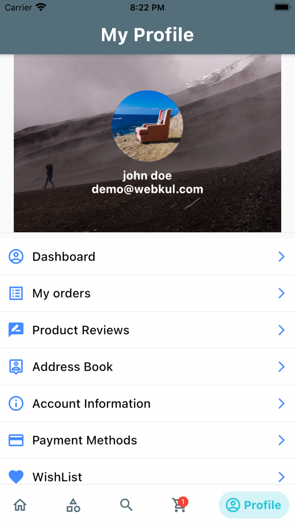
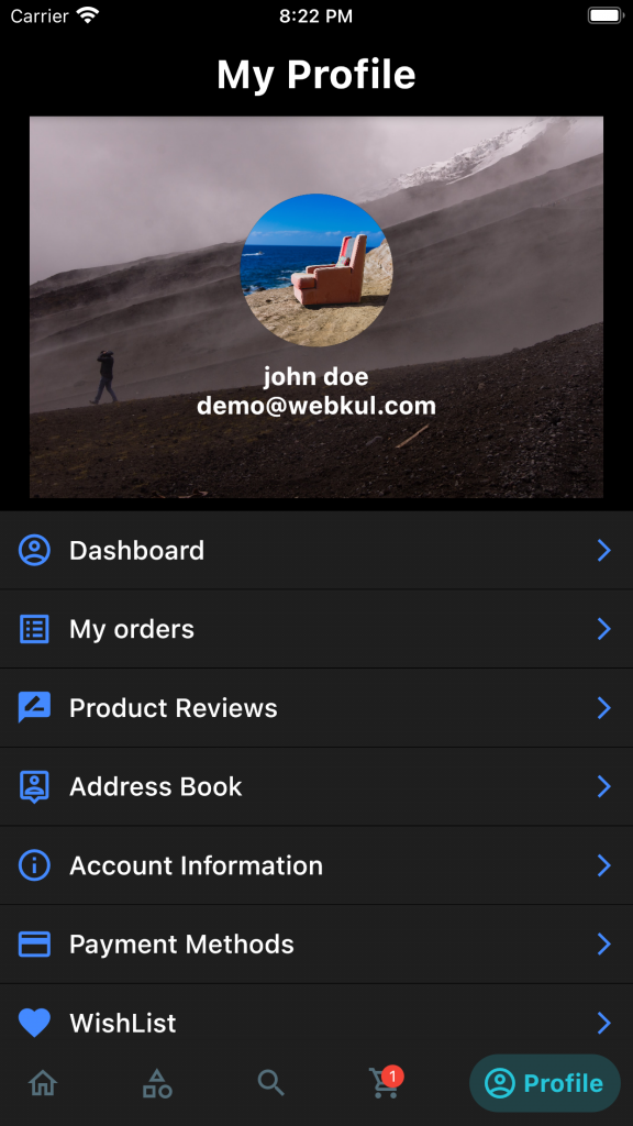
In this blog, I will implement a custom theme for both dark and light and also use common font for all widgets.
Let’s start.
First, create a Theme class and add color according to what you want in your app.
|
1 2 3 4 5 6 7 8 9 10 11 12 13 14 15 16 17 18 19 20 21 22 23 24 25 26 27 28 29 30 31 32 33 34 35 36 37 38 39 40 41 42 43 44 45 46 47 48 49 50 51 52 53 54 55 56 57 58 59 60 61 62 63 64 65 66 67 68 69 70 71 72 73 74 |
class AppTheme { AppTheme._(); static Color _iconColor = Colors.blueAccent.shade200; static const Color _lightPrimaryColor = Color(0xFF546E7A); static const Color _lightPrimaryVariantColor = Color(0xFF546E7A); static const Color _lightSecondaryColor = Colors.green; static const Color _lightOnPrimaryColor = Colors.black; static const Color _darkPrimaryColor = Colors.white24; static const Color _darkPrimaryVariantColor = Colors.black; static const Color _darkSecondaryColor = Colors.white; static const Color _darkOnPrimaryColor = Colors.white; static final ThemeData lightTheme = ThemeData( appBarTheme: AppBarTheme( titleTextStyle: TextStyle(color:_darkSecondaryColor,fontFamily: "Roboto",fontWeight: FontWeight.bold,fontSize: 26 ), color: _lightPrimaryVariantColor, iconTheme: IconThemeData(color: _lightOnPrimaryColor), ), colorScheme: ColorScheme.light( primary: _lightPrimaryColor, primaryVariant: _lightPrimaryVariantColor, secondary: _lightSecondaryColor, onPrimary: _lightOnPrimaryColor, ), iconTheme: IconThemeData( color: _iconColor, ), textTheme: _lightTextTheme, dividerTheme: DividerThemeData( color: Colors.black12 ) ); static final ThemeData darkTheme = ThemeData( scaffoldBackgroundColor: _darkPrimaryVariantColor, appBarTheme: AppBarTheme( color: _darkPrimaryVariantColor, iconTheme: IconThemeData(color: _darkOnPrimaryColor), ), colorScheme: ColorScheme.dark( primary: _darkPrimaryColor, primaryVariant: _darkPrimaryVariantColor, secondary: _darkSecondaryColor, onPrimary: _darkOnPrimaryColor, background: Colors.white12, ), iconTheme: IconThemeData( color: _iconColor, ), textTheme: _darkTextTheme, dividerTheme: DividerThemeData( color: Colors.black ) ); static final TextTheme _lightTextTheme = TextTheme( headline1: _lightScreenHeading1TextStyle, ); static final TextTheme _darkTextTheme = TextTheme( headline1: _darkScreenHeading1TextStyle, ); static final TextStyle _lightScreenHeading1TextStyle = TextStyle(fontSize: 26.0,fontWeight:FontWeight.bold, color: _lightOnPrimaryColor,fontFamily: "Roboto"); static final TextStyle _darkScreenHeading1TextStyle = _lightScreenHeading1TextStyle.copyWith(color: _darkOnPrimaryColor); } |
Now call the Theme element.
|
1 2 |
Theme.of(context).textTheme.headline1 Theme.of(context).colorScheme.background |
I hope this code will help you better to understand Custom Theme in flutter. If you feel any doubt or query please comment below.
Thanks for the read this blog and if you want to visit my other blog click here.

2 comments
MaterialApp(title: ‘Flutter Demo’,
theme: AppTheme.lightTheme,
darkTheme: AppTheme.darkTheme,)
Thanks