Buttons In Flutter are the graphical control element that allows a user to trigger an event such as taking actions, making choices, searching things, and many more. They can be placed anywhere in our UI like dialogs, forms, cards, toolbars, etc.
Buttons In Flutter is a part of the material design library. Flutter provides several types of buttons that have different shapes, styles, and features.
You can also check out our Flutter app development services for more Flutter app development.
Features of Buttons
The standard features of a button in Flutter are given below:
- We can easily apply themes to buttons, shapes, colors, animation, and behavior.
- We can also theme icons and text inside the button.
- Buttons can be composed of different child widgets with different characteristics.
Types of Buttons in Flutter used now
Following are the different types of buttons available in Flutter:
- Text Button
- Elevated Button
- Floating Button
- Icon Button
- Outlined Button
- InkWell
- DropdownButton
- PopupMenu Button
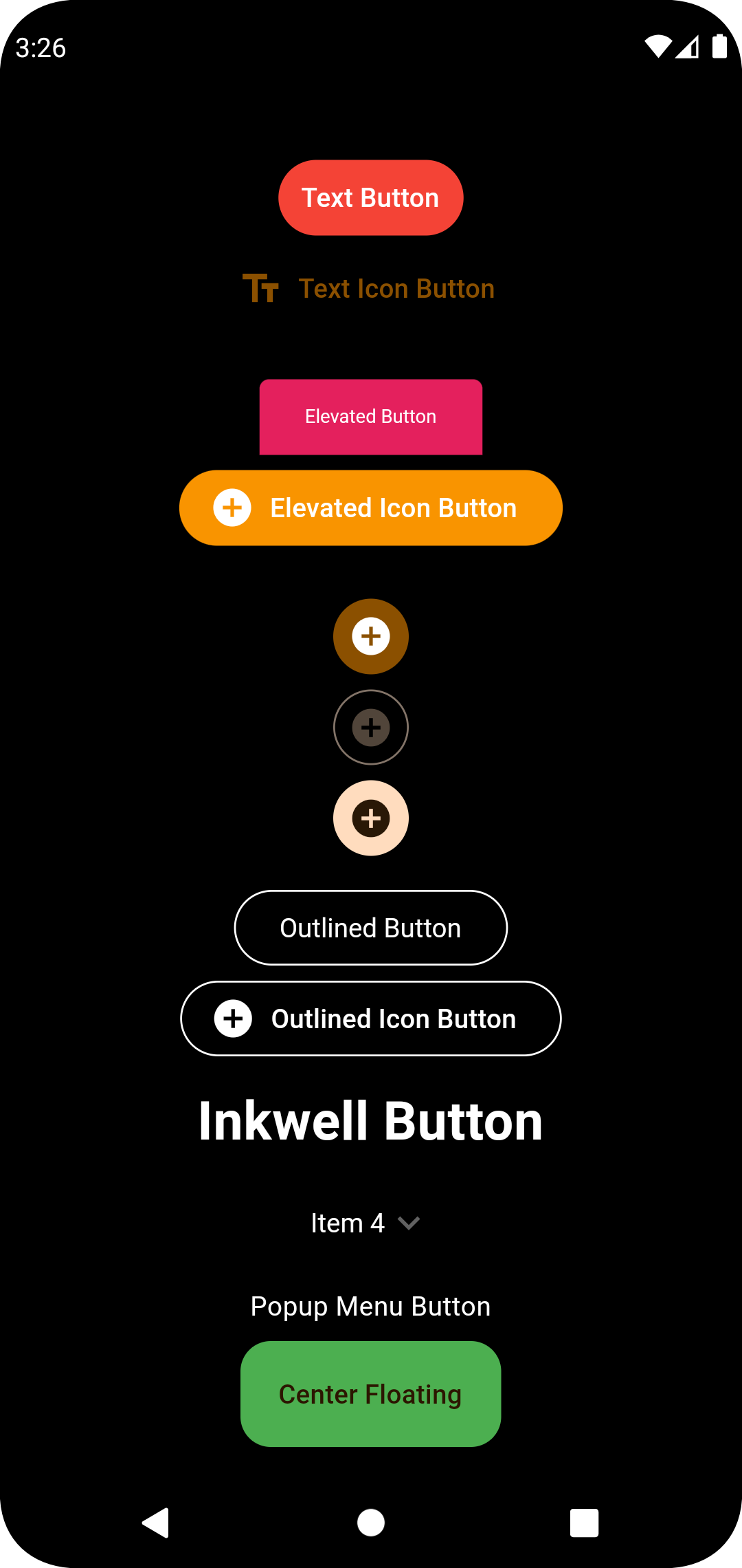
1. Text Button
It is a text label button that does not have much decoration and is displayed without any elevation. The FlatButton is deprecated, now flutter uses the TextButton has two required properties that are: child and onPressed(). It is mostly used in toolbars, dialogs, or inline with other content. By default, the Text button has no color, and its text color depends on the theme color.
NOTE: We can add the icon also to the Text Button eg: TextButton.icon
|
1 2 3 4 5 6 7 8 9 10 11 12 13 14 15 16 17 18 19 20 21 22 23 24 25 |
TextButton( onPressed: () { ScaffoldMessenger.of(context) .showSnackBar(const SnackBar(content: Text("I am Pressed "))); }, onLongPress: () { ScaffoldMessenger.of(context) .showSnackBar(const SnackBar(content: Text("I am Long Pressed "))); }, style: TextButton.styleFrom( foregroundColor: Colors.white, backgroundColor: Colors.red, ), child: const Text("Text Button"), ) /// TextButton With Icon TextButton.icon( onPressed: () {}, onLongPress: () {}, icon: const Icon(Icons.text_fields), label: const Text("Text Icon Button"), ), |
2. Elevated Button
It is a button, which is based on the material widget and has a rectangular body. It is similar to a Text button, but it has an elevation that will increase when the button is pressed.
This button has Two callback functions for Use on the App end.
onPressed(): It is triggered when the button is pressed.
onLongPress(): It is triggered when the button is long pressed.
Styling for the elevated button is done using ElevatedButton.styleFrom.
It is to be noted that this button is in a disabled state if onPressed() and onLongPressed() callbacks are not specified.
Here is the Code with its some Properties.
NOTE: Elevated Button also supports icon widgets eg: ElevatedButton.Icon()
|
1 2 3 4 5 6 7 8 9 10 11 12 13 14 15 16 17 18 19 20 21 22 23 24 25 26 27 28 29 |
ElevatedButton( onPressed: () {}, onLongPress: () {}, style: TextButton.styleFrom( foregroundColor: Colors.white, backgroundColor: Colors.pink, shape: const RoundedRectangleBorder( borderRadius: BorderRadius.only( topLeft: Radius.circular(5.0), topRight: Radius.circular(5.0), ), ), textStyle: const TextStyle( color: Colors.white, fontSize: 10, fontStyle: FontStyle.normal), ), child: const Text("Elevated Button"), ), /// ElevatedButton.icon( onPressed: () {}, onLongPress: () {}, icon: const Icon(Icons.add_circle), label: const Text("Elevated Icon Button"), ), |
3. Floating Action Button
A FAB button is a circular icon button that triggers the primary action in our application. It is the most used button in today’s applications. We can use this button for adding, refreshing, or sharing the content. Flutter suggests using at most one FAB button per screen. There are two types of Floating Action Button:
FloatingActionButton: It creates a simple circular floating button with a child widget inside it. It must have a child parameter to display a widget.
FloatingActionButton.extended: It creates a wide floating button along with an icon and a label inside it. Instead of a child, it uses labels and icon parameters.
NOTE: FloatingActionButton has more properties. Mainly we used FloatingAction Button within the scaffold Widget.
|
1 2 3 4 5 6 7 8 9 10 11 12 13 14 15 16 |
/// Without Extended floatingActionButton: FloatingActionButton( onPressed: buttonClicked, tooltip: 'Increment', child: const Icon(Icons.add), ), /// With Extended floatingActionButton: FloatingActionButton.extended( onPressed: buttonClicked, tooltip: 'Increment', icon: const Icon(Icons.add), label: Text("Add"), ), |
An Example for FloatingActionButton with Center Float.
|
1 2 3 4 5 6 7 8 9 10 11 12 13 14 15 16 17 18 19 20 |
Scaffold( backgroundColor: Colors.transparent, body: Center( child: Column( mainAxisAlignment: MainAxisAlignment.center, children: [ Text("Buttons"), ], ), ), floatingActionButtonLocation: FloatingActionButtonLocation.center Float, floatingActionButton: FloatingActionButton.extended( onPressed: () {}, backgroundColor: Colors.green, label: const Text("Center Floating"), ), ); |
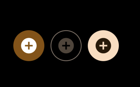
4. Icon Button
An IconButton is a picture printed on the Material widget. It is a useful widget that gives the Flutter UI a material design feel. We can also customize the look and feel of this button. In simple terms, it is an icon that reacts when the user will touch it.
|
1 2 3 4 5 6 7 8 9 10 11 12 13 14 15 |
IconButton.filled( onPressed: (){}, icon: const Icon(Icons.add_circle)), IconButton.outlined( onPressed: (){}, icon: const Icon(Icons.add_circle)), IconButton.filledTonal( onPressed: (){}, icon: const Icon(Icons.add_circle)) |
5. Outlined Button
It is similar to the Text button, but it contains a thin grey rounded rectangle border. Its outlined border is defined by the shape attribute.
|
1 2 3 4 5 6 7 8 9 10 11 12 13 14 15 16 17 18 19 20 21 22 23 24 25 26 27 28 29 30 |
// Without Icon Button OutlinedButton( onPressed: () {}, onLongPress: () {}, style: OutlinedButton.styleFrom( shape: const StadiumBorder(), side: const BorderSide(width: 1, color: Colors.red), ), child: const Text("Outlined Button"), ), /// With Icon Button OutlinedButton.icon( onPressed: () {}, onLongPress: () {}, style: OutlinedButton.styleFrom( shape: const StadiumBorder(), side: const BorderSide(width: 1, color: Colors.white), ), icon: const Icon( Icons.add_circle, color: Colors.white, ), label: const Text( "Outlined Icon Button", style: TextStyle(color: Colors.white), ), ) |

6. InkWell Button
InkWell is the material widget in flutter. It responds to the touch action as performed by the user. There are so many gestures like double-tap, long press, tap down, etc. Below are the so many properties of this widget. We can set the radius of the inkwell widget using radius and also border-radius using borderRadius. We can give the splash color using splashColor and can do a lot of things.
NOTE: Visit Flutter’s official documentation for details of the InkWell_Button.
|
1 2 3 4 5 6 7 8 9 10 11 12 13 |
InkWell( onTap: () {}, onLongPress: () {}, child: const Text( 'Inkwell Button', textScaleFactor: 2, style: TextStyle( fontWeight: FontWeight.bold, color: Colors.white), ), ) |
6. DropDown Button
A DropDownButton is a material design button. The DropDownButton is a widget that we can use to select one unique value from a set of values. It allows the user to select one value from some items. The default value shows the currently selected value. On clicking the DropDownButton it opens a list of items, from which the user can select the desired option.
NOTE: Visit Flutter’s official documentation for details of the DropDownButton.
|
1 2 3 4 5 6 7 8 9 10 11 12 13 14 15 16 17 18 |
DropdownButton( value: dropdownvalue, /// To Hide the Underline underline: const SizedBox(), icon: const Icon(Icons.keyboard_arrow_down), style: const TextStyle(color: Colors.white), items: items.map((String items) { return DropdownMenuItem( value: items, child: Text(items), ); }).toList(), onChanged: (String? newValue) { dropdownvalue = newValue!; }, ) |
7. Popup Menu Button
Popup menus are one of the most used widgets whether they be in a phone or a computer. The most common example of a popup menu would be when you right-click with your mouse and see some additional options of rename, delete, copy, paste.
|
1 2 3 4 5 6 7 8 9 10 11 12 13 14 15 |
PopupMenuButton( onSelected: (value) {}, child: const Text( "Popup Menu Button", style: TextStyle(color: Colors.white), ), itemBuilder: (BuildContext bc) { return const [ PopupMenuItem(value: '', child: Text("Value 1")), PopupMenuItem(value: '', child: Text("Value 2")), ]; }, ) |
That’s all for this Article.
Conclusion
We learned about some Buttons in Flutter in this blog.
Visit the link for additional information on the Buttons Widget in Flutter.
Thanks for reading this blog. You can also check other blogs from here for more knowledge.

Be the first to comment.