Card Widget In Flutter?
Do you know about card view in android, if yes then you are very familiar with this, yes the card widget here is almost the same like we use in android with properties elevation, rounded corners, and much more.
You may also check our flutter app development services.
If not, then don’t worry, we will check out it in this article.
We use card to show our views inside a card. it can be used to display a list of some specific data like- call or phone list on your Mobile phone.
In Flutter it is designed from Google’s Material Design Library.
Apart from elevation and rounded corner property, it has many more properties like color, shape, shadow color, etc which lets us customize it the way we want.
Constructor of card Widget.
|
1 2 3 4 5 6 7 8 9 10 11 12 |
const Card({ Key? key, this.color, this.shadowColor, this.elevation, this.shape, this.borderOnForeground = true, this.margin, this.clipBehavior, this.child, this.semanticContainer = true, }) |
Let’ take a simple example to explore it more.
Example Of Card Widget
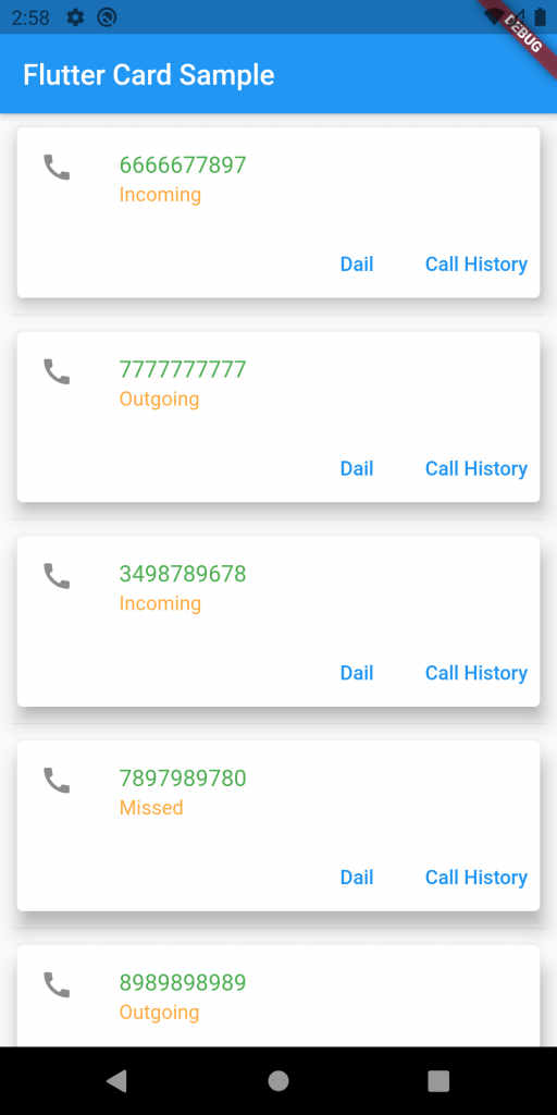
In this example, we are showing a list of some phone calls details using static data.
|
1 2 3 4 5 6 7 8 9 10 11 12 13 14 15 16 17 18 19 20 21 22 23 24 25 26 27 28 29 30 31 32 33 34 35 36 37 38 39 40 41 42 43 44 45 46 47 48 49 50 51 52 53 54 55 56 57 58 59 60 61 62 63 64 65 66 67 68 69 70 71 72 73 74 75 76 77 78 79 80 81 82 83 84 85 |
import 'package:flutter/material.dart'; void main() => runApp(const MyApp()); class MyApp extends StatelessWidget { const MyApp({Key key}) : super(key: key); @override Widget build(BuildContext context) { return MaterialApp( home: Scaffold( appBar: AppBar(title: const Text("Flutter Card Sample")), body: const MyStatelessWidget(), ), ); } } class MyStatelessWidget extends StatelessWidget { const MyStatelessWidget({Key key}) : super(key: key); @override Widget build(BuildContext context) { final List<String> phoneNumber = <String>[ '6666677897', '7777777777', '3498789678', '7897989780' ]; final List<String> callType = <String>[ "Incoming", "Outgoing", "Incoming", "Missed" ]; return ListView.separated( shrinkWrap: true, padding: const EdgeInsets.all(8), itemCount: phoneNumber.length, itemBuilder: (BuildContext context, int index) { return Card( color: Colors.white, borderOnForeground: true, elevation: 10, child: Column( mainAxisSize: MainAxisSize.min, children: <Widget>[ ListTile( leading: Icon(Icons.call), title: Text("${phoneNumber[index]}", style: TextStyle(color: Colors.green)), subtitle: Text( "${callType[index]}", style: TextStyle(color: Colors.orangeAccent), ), ), Row( mainAxisAlignment: MainAxisAlignment.end, children: <Widget>[ TextButton( child: const Text('Dail'), onPressed: () {/* ... */}, ), const SizedBox(width: 8), TextButton( child: const Text('Call History'), onPressed: () {/* ... */}, ), ], ), ], ), ); }, separatorBuilder: (BuildContext context, int index) => const Divider(), ); } } |
Result:

Conclusion
In this blog, we learn how we can use the Card Widget in our Flutter app to design our views.
Thanks For Reading

Be the first to comment.