Working with Themes in Flutter, themes are the most basic and undoubtedly the most important aspect in terms of websites and applications.
In flutter, we can define App-wide themes or we can also use Theme widgets that define the color and font style for a particular part of the app.
In order to create an App-wide Theme, we will need to define ThemeData to the MaterialApp Widget.
Looking out for starting with Flutter app development, check our Flutter app development page.
|
1 2 3 4 5 6 7 8 9 |
Widget build(BuildContext context) { return MaterialApp( theme: ThemeData( primaryColor: Colors.redAccent, accentColor: Colors.white), debugShowCheckedModeBanner: false, home: HomePage(), ); } |
Here, we have specified two colors in our ThemeData, i.e., primary color and accent color.
|
1 2 3 4 5 6 7 8 9 10 11 12 13 14 15 16 17 18 19 20 21 22 23 24 25 26 27 28 29 30 31 32 33 34 35 36 37 38 39 40 41 42 43 44 45 46 47 48 49 50 51 52 53 54 55 56 57 58 59 60 61 62 63 64 65 66 67 68 69 70 71 72 73 74 75 76 77 78 79 80 81 82 |
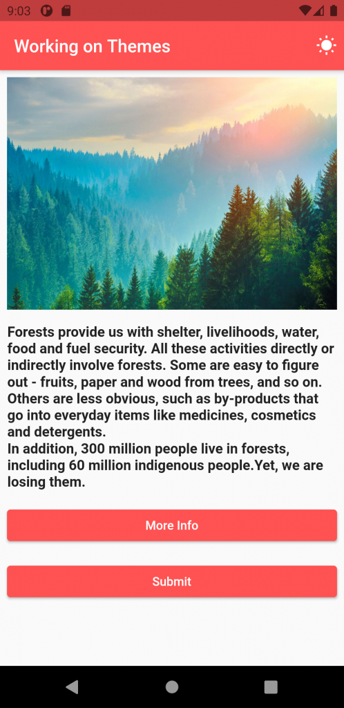
import 'package:flutter/material.dart'; void main() { runApp(MyApp()); } class MyApp extends StatelessWidget { @override Widget build(BuildContext context) { return MaterialApp( theme: ThemeData( primaryColor: Colors.redAccent, accentColor: Colors.white, elevatedButtonTheme: ElevatedButtonThemeData( style: ButtonStyle( backgroundColor: MaterialStateProperty.all(Colors.redAccent) ) ), ), debugShowCheckedModeBanner: false, home: HomePage(), ); } } class HomePage extends StatefulWidget { @override _HomePageState createState() => _HomePageState(); } class _HomePageState extends State<HomePage> { @override Widget build(BuildContext context) { return Scaffold( appBar: AppBar( title: Text("Working on Themes"), actions: [ Padding( padding: const EdgeInsets.only(right: 8.0), child: Icon(Icons.wb_sunny), ), ], ), body: Padding( padding: const EdgeInsets.all(8.0), child: Column( children: [ Image.network( 'https://api.timeforkids.com/wp-content/uploads/2019/09/final-cover-forest.jpg'), Padding( padding: const EdgeInsets.only(top: 16.0), child: Text( 'Forests provide us with shelter, livelihoods, water, food and fuel security. All these activities directly or indirectly involve forests. Some are easy to figure out - fruits, paper and wood from trees, and so on. Others are less obvious, such as by-products that go into everyday items like medicines, cosmetics and detergents.', style: TextStyle(fontSize: 16.0, fontWeight: FontWeight.bold), ), ), Text('In addition, 300 million people live in forests, including 60 million indigenous people.Yet, we are losing them.', style: TextStyle(fontSize: 16.0, fontWeight: FontWeight.bold)), Padding( padding: const EdgeInsets.only(top: 16.0), child: Container( child: ElevatedButton( onPressed: () {}, child: Text("More Info"), ), width: MediaQuery.of(context).size.width, ), ), Padding( padding: const EdgeInsets.only(top: 16.0), child: Container( child: ElevatedButton( onPressed: () {}, child: Text("Submit"), ), width: MediaQuery.of(context).size.width, ), ), ], ), )); } } |
In addition to primary Color and accent Color, we have specified the elevatedButtonTheme. ElevatedButtonThemeData contains multiple properties within it.
Here, we have used the backgroundColor property to specify the background color for the Elevated Buttons used in our app.
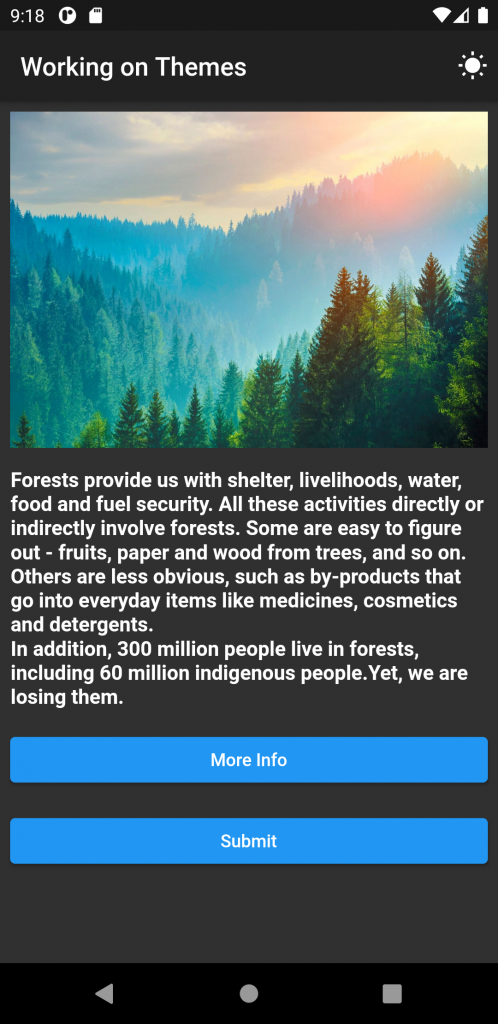
Now, if we specify the darkTheme property in the MaterialApp, the app will work in Dark Mode, if the Device Display Mode is turned to DarkMode.
|
1 2 3 4 5 6 7 8 9 10 11 12 13 14 15 16 |
Widget build(BuildContext context) { return MaterialApp( theme: ThemeData( primaryColor: Colors.redAccent, accentColor: Colors.white, elevatedButtonTheme: ElevatedButtonThemeData( style: ButtonStyle( backgroundColor: MaterialStateProperty.all(Colors.redAccent) ) ), ), darkTheme: ThemeData.dark(), debugShowCheckedModeBanner: false, home: HomePage(), ); } |
The output will be –
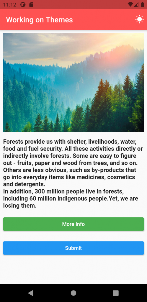
If we want to add the specific theme to a particular widget or part of the app, we can wrap it with Theme Widget.
In Theme Widget, we have the property as data in which we can add the ThemeData.
|
1 2 3 4 5 6 7 8 9 10 11 12 13 14 15 16 17 18 19 |
Padding( padding: const EdgeInsets.only(top: 16.0), child: Container( child: Theme( data: ThemeData( elevatedButtonTheme: ElevatedButtonThemeData( style: ButtonStyle( backgroundColor: MaterialStateProperty.all(Colors.green) ) ), ), child: ElevatedButton( onPressed: () {}, child: Text("More Info"), ), ), width: MediaQuery.of(context).size.width, ), ), |
The output will be –
Conclusion
In this blog, we have read about Working with Themes in Flutter.
I hope it will help you out in understanding and getting a brief idea about it.
Here are some of our other blogs- https://mobikul.com/blog/
Thank you for reading!!
References
https://wwf.panda.org/discover/our_focus/forests_practice/importance_forests/


Be the first to comment.