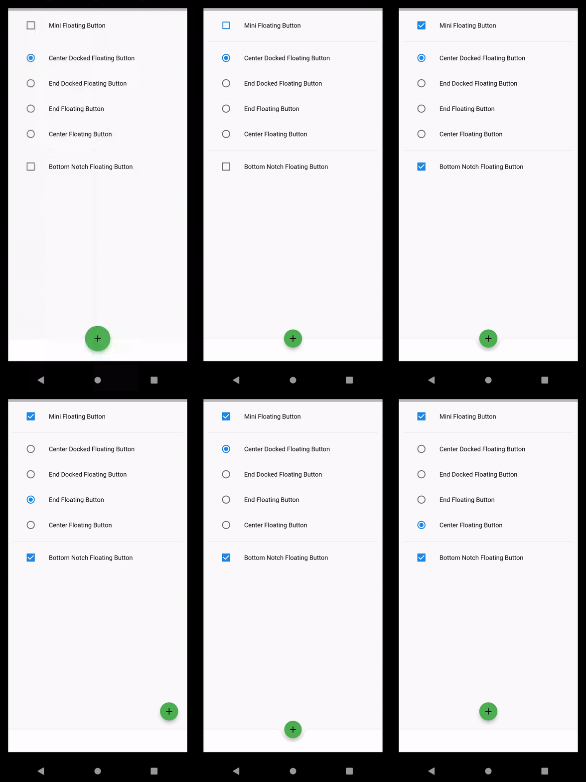
A FloatingActionButton is a circular icon button in material design that hovers over content to promote a primary action in the application.
Use FloatingActionButton class is a circular icon button in material design that hovers over content to promote a primary action in the application. Floating action buttons are most commonly used in the Scaffold.floatingActionButton field.
You may also check our Flutter app development services page.
To implement the FloatingActionButton do follow the steps mentioned below.
1.) Create a Scaffold.
2.) Create the FloatingActionButton as you desire.
3.) Use the mini fab button for implementing the indication to the user.
1.) Create a Scaffold. :
Inside Scaffold widgets, it Implements the basic material design visual layout structure. First, initialize the main app as a stateless widget.
This class provides APIs for showing drawers and bottom sheets. We can add the background color inside the scaffold widget.
It also supports special Material Design components, such as Drawers, AppBars, and SnackBars.
|
1 2 3 4 5 6 7 8 9 10 11 12 13 14 15 16 17 18 19 20 |
void main() { runApp(const MyApp()); } class MyApp extends StatelessWidget { const MyApp({Key? key}) : super(key: key); // This widget is the root of your application. @override Widget build(BuildContext context) { return MaterialApp( debugShowCheckedModeBanner: false, title: 'FloatingActionButton Demo', theme: ThemeData( primarySwatch: Colors.blue, ), home: const DemoFloatingButtonScreen(title: 'FloatingActionButton Home Page'), ); } } |
2.) Create the FloatingActionButton as you desire.
Now, Floating action buttons should be used for positive actions such as “create”, “share”, or “navigate”. First, create one object of floating button positions.
Here we have created four positions by using enum.
|
1 2 3 4 5 6 |
enum POSITIONS { endDocked, centerFloat, endFloat, centerDocked } class DemoFloatingButtonScreen extends StatefulWidget { @override _DemoFloatingButtonScreenState createState() => _DemoFloatingButtonScreenState(); } |
3.) Use the mini fab button for implementing the indication to the user.
If the onPressed callback is null, then the button will be disabled and will not reach touch. such as considering changing the background color if disabling the floatingActionButton.
When this button floats above the content of the screen usually resides the one corner of the screen.
A mini FAB can also create visual continuity with other screen elements.
The full code is mentioned below.
|
1 2 3 4 5 6 7 8 9 10 11 12 13 14 15 16 17 18 19 20 21 22 23 24 25 26 27 28 29 30 31 32 33 34 35 36 37 38 39 40 41 42 43 44 45 46 47 48 49 50 51 52 53 54 55 56 57 58 59 60 61 62 63 64 65 66 67 68 69 70 71 72 73 74 75 76 77 78 79 80 81 82 83 84 85 86 87 88 89 90 91 92 93 94 95 96 97 98 99 100 101 102 103 104 105 106 |
class _DemoFloatingButtonScreenState extends State<DemoFloatingButtonScreen> { FloatingActionButtonLocation _fabButtonLocation = FloatingActionButtonLocation.centerDocked; POSITIONS? _positionCharacter = POSITIONS.centerDocked; bool? _isNotched = false; bool? _isMini = false; @override Widget build(BuildContext context) { return Padding( padding: const EdgeInsets.all(18.0), child: Scaffold( body: ListView( padding: const EdgeInsets.all(10), children: <Widget>[ ListTile( title: Text("Mini Floating Button"), leading: Checkbox( value: _isMini, onChanged: (bool) => { setState(() { _isMini = bool; }) }, ), ), Divider(), ListTile( title: Text("Center Docked Floating Button"), leading: Radio( value: POSITIONS.centerDocked, groupValue: _positionCharacter, onChanged: (POSITIONS? value) { setState(() { _positionCharacter = value; _fabButtonLocation = FloatingActionButtonLocation.centerDocked; }); }, ), ), ListTile( title: Text("End Docked Floating Button"), leading: Radio( value: POSITIONS.endDocked, groupValue: _positionCharacter, onChanged: (POSITIONS? value) { setState(() { _positionCharacter = value; _fabButtonLocation = FloatingActionButtonLocation.endDocked; }); }, ), ), ListTile( title: Text("End Floating Button"), leading: Radio( value: POSITIONS.endFloat, groupValue: _positionCharacter, onChanged: (POSITIONS? value) { setState(() { _positionCharacter = value; _fabButtonLocation = FloatingActionButtonLocation.endFloat; }); }, ), ), ListTile( title: Text("Center Floating Button"), leading: Radio( value: POSITIONS.centerFloat, groupValue: _positionCharacter, onChanged: (POSITIONS? value) { setState(() { _positionCharacter = value; _fabButtonLocation = FloatingActionButtonLocation.centerFloat; }); }, ), ), Divider(), ListTile( title: Text("Bottom Notch Floating Button"), leading: Checkbox( value: _isNotched, onChanged: (bool) => { setState(() { _isNotched = bool; }) }, ), ), ], ), floatingActionButton: FloatingActionButton( child: Icon(Icons.add), mini: this._isMini!, onPressed: () => {}), floatingActionButtonLocation: this._fabButtonLocation, bottomNavigationBar: BottomAppBar( shape: _isNotched! ? CircularNotchedRectangle() : null, child: Container( height: 50.0, ), ), ), ); } } |

We can now run the app on how to create FloatingActionButton in a flutter.
Finally, we have implemented the flow of creating FloatingActionButton in a flutter.
Hope this blog helps you to create FloatingActionButton in a flutter.
So, I hope it will help you out in understanding and get a brief idea about it.
You can also check these links.
Another mentioned URL.
For more understanding please can go through this Link:
That’s all, You can enjoy your FloatingActionButton implementation in a flutter.
Thank you very much.

Be the first to comment.