SwiftUI Animation:
SwiftUI provides two types of animations: implicit and explicit. Both approaches allow you to animate views and view transitions. implicit animations are animations that you specify using the .animation() modifier. This method is used on bindings, and it asks SwiftUI to animate any changes that result in the binding’s value being modified.
Explicity animations offer a more finite control over the animations you want to present. Instead of attaching a modifier to the view, you tell SwiftUI what state changes you want to animate inside the withAnimation() block.
Implicit Animation:
Let’s create a new project SwiftUIAnimation.


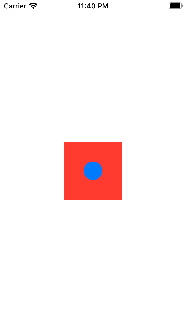
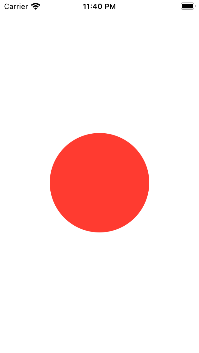
Take a look at the figure above. It’s a simple tappable view that is composed of a green circle and a rectangle. When a user taps the square or circle, the circle’s colour will be changed to blue and the rectangle’s colour to red. At the same time, the size of the rectangle icon grows bigger. So, we have various state changes here:
- The colour of the circle changes from red to blue.
- The colour of the rectangle icon changes from blue to red.
The rectangle icon doubles its original size.
|
1 2 3 4 5 6 7 8 9 10 11 12 13 14 15 16 17 18 19 20 21 22 23 24 25 26 27 28 29 30 31 32 33 34 35 36 |
import SwiftUI struct ContentView: View { @State private var circleColorChanged = false @State private var rectColorChanged = false @State private var rectSizeChanged = false @State private var circlesizeChanged = false var body: some View { ZStack { Rectangle() .frame(width: 100, height: 100) .foregroundColor(circleColorChanged ? Color(.blue) : .red) Circle() .foregroundColor(rectColorChanged ? .red : .blue) .font(.system(size: 10)) .scaleEffect(rectSizeChanged ? 0.5 : 0.1) } .animation(.default) .onTapGesture { self.circleColorChanged.toggle() self.rectColorChanged.toggle() self.rectSizeChanged.toggle() self.circlesizeChanged.toggle() } } } struct ContentView_Previews: PreviewProvider { static var previews: some View { ContentView() } } |
Explicit Animations:
Let’s see how we can achieve the same result using explicit animation.
|
1 2 3 4 5 6 7 8 9 10 11 12 13 14 15 16 17 18 19 20 21 22 23 24 25 26 27 28 29 30 31 32 33 34 35 36 |
import SwiftUI struct ContentView: View { @State private var circleColorChanged = false @State private var rectColorChanged = false @State private var rectSizeChanged = false @State private var circlesizeChanged = false var body: some View { ZStack { Rectangle() .frame(width: 100, height: 100) .foregroundColor(circleColorChanged ? Color(.blue) : .red) Circle() .foregroundColor(rectColorChanged ? .red : .blue) .font(.system(size: 10)) .scaleEffect(rectSizeChanged ? 0.5 : 0.1) } // .animation(.default) .onTapGesture { withAnimation(.default) { self.circleColorChanged.toggle() self.rectColorChanged.toggle() self.rectSizeChanged.toggle() } } } } struct ContentView_Previews: PreviewProvider { static var previews: some View { ContentView() } |
Synchronizing views with MatchedGeometryEffect:
This is useful if you want to animate a view’s transition to a different part of the same view hierarchy :-
for example, going from a list view to a zoomed detail view – then you should use SwiftUI’s matchedGeometryEffect() modifier, which is a bit like Magic Move in Keynote.
To use the modifier, attach it to a pair of views that are the same, in different parts of your hierarchy. With that done, when you switch between your two view states you’ll find SwiftUI smoothly animates your synchronized view.
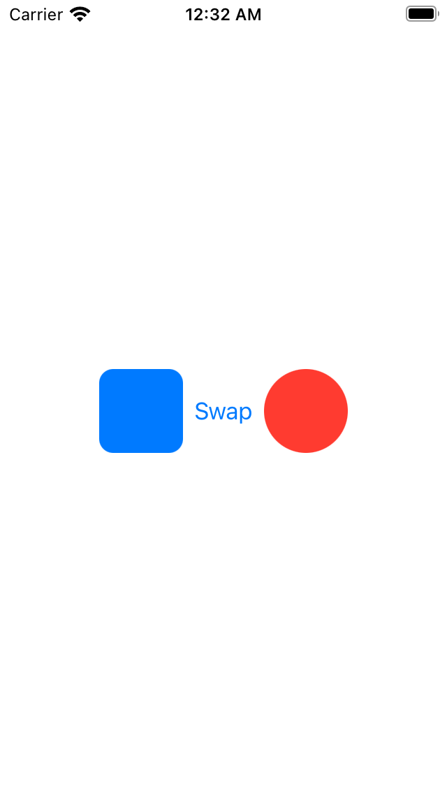
Let’s look at a simple example of matchedGeometry in action:
|
1 2 3 4 5 6 7 8 9 10 11 12 13 14 15 16 17 18 19 20 21 22 23 24 25 26 27 28 29 30 31 32 33 34 35 36 37 38 39 40 41 42 |
struct ContentView: View { @Namespace private var animation @State private var isFlipped = false var body: some View { HStack { if isFlipped { RoundedRectangle(cornerRadius: 10) .fill(Color.blue) .frame(width: 60, height: 60) .matchedGeometryEffect(id: "part1", in: animation, properties: .size) Button("Swap") { withAnimation(.easeInOut(duration: 1.0)) { isFlipped.toggle()}} Circle() .fill(Color.red) .frame(width: 60, height: 60) .matchedGeometryEffect(id: "part2", in: animation, properties: .position) } else { Circle() .fill(Color.red) .frame(width: 30, height: 30) .matchedGeometryEffect(id: "part1", in: animation, properties: .frame) Button("Swap") { withAnimation(.easeInOut(duration: 1.0)) { isFlipped.toggle()}} RoundedRectangle(cornerRadius: 10) .fill(Color.blue) .frame(width: 30, height: 30) .matchedGeometryEffect(id: "part2", in: animation, properties: .size) } } .onTapGesture { withAnimation { self.isFlipped.toggle() } } } } |


For other blogs Please click here

Be the first to comment.