BackdropScaffold Overview:
BackdropScaffold is a component that helps build a user interface by organizing multiple components in a cohesive layout and managing their interactions. It ensures proper alignment and coordination between various UI elements.
Key Components/Parameters:
backLayerContent:- Purpose: Displays the content of the back layer, typically used for main menu items or primary content.
frontLayerContent:- Purpose: Shows content related to the selected menu item from the back layer. It updates based on user selection.
appBar:- Purpose: Provides an app bar for the back layer. It can include menu options like a cart and search.
- Visibility: The visibility of the app bar can be controlled using the
persistentAppBarparameter, which determines whether the app bar remains visible when the back layer is revealed.
scaffoldState:- Purpose: Manages the state of the
BackdropScaffold. It usesBackdropScaffoldStateto handle the state and interactions within the scaffold.
- Purpose: Manages the state of the
|
1 2 3 4 5 6 7 8 9 10 11 12 13 14 15 16 17 18 19 20 21 22 |
@Composable @ExperimentalMaterialApi fun BackdropScaffold( appBar: @Composable () -> Unit, backLayerContent: @Composable () -> Unit, frontLayerContent: @Composable () -> Unit, modifier: Modifier = Modifier, scaffoldState: BackdropScaffoldState = rememberBackdropScaffoldState(Concealed), gesturesEnabled: Boolean = true, peekHeight: Dp = BackdropScaffoldDefaults.PeekHeight, headerHeight: Dp = BackdropScaffoldDefaults.HeaderHeight, persistentAppBar: Boolean = true, stickyFrontLayer: Boolean = true, backLayerBackgroundColor: Color = MaterialTheme.colors.primary, backLayerContentColor: Color = contentColorFor(backLayerBackgroundColor), frontLayerShape: Shape = BackdropScaffoldDefaults.frontLayerShape, frontLayerElevation: Dp = BackdropScaffoldDefaults.FrontLayerElevation, frontLayerBackgroundColor: Color = MaterialTheme.colors.surface, frontLayerContentColor: Color = contentColorFor(frontLayerBackgroundColor), frontLayerScrimColor: Color = BackdropScaffoldDefaults.frontLayerScrimColor, snackbarHost: @Composable (SnackbarHostState) -> Unit = { SnackbarHost(it) } ) |
Example Of BackdropScaffold
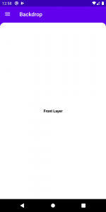
Let’s take a simple example to show a backdrop with a back layer and a front layer.
|
1 2 3 4 5 6 7 8 9 10 11 12 13 14 15 16 17 18 19 20 21 22 23 24 25 26 27 28 29 30 31 32 33 34 35 36 37 38 39 40 41 42 43 44 45 46 47 48 49 50 51 52 53 54 55 56 57 58 59 60 61 62 63 64 65 66 67 68 69 70 71 72 73 74 75 76 77 78 79 80 81 |
class MainActivity : ComponentActivity() { @ExperimentalMaterialApi override fun onCreate(savedInstanceState: Bundle?) { super.onCreate(savedInstanceState) setContent { val scaffoldState = rememberBackdropScaffoldState(initialValue = BackdropValue.Concealed) val scope = rememberCoroutineScope() BackDropsampleTheme { BackdropScaffold( scaffoldState = scaffoldState, appBar = { TopAppBar( title = { Text("Backdrop") }, navigationIcon = { if (scaffoldState.isConcealed) { IconButton( onClick = { scope.launch { scaffoldState.reveal() } } ) { Icon( Icons.Default.Menu, contentDescription = "Menu" ) } } else { IconButton( onClick = { scope.launch { scaffoldState.conceal()} } ) { Icon( Icons.Default.Close, contentDescription = "Close" ) } } }, elevation = 0.dp, backgroundColor = Color.Transparent ) }, backLayerContent = { Column{ Text(text = "Menu Item 1", modifier = Modifier.padding(8.dp), color = Color.White,style = TextStyle( fontWeight = FontWeight.Bold, fontSize = 14.sp, color = Color.Black )) Text(text = "Menu Item 1", modifier = Modifier.padding(8.dp), color = Color.White,style = TextStyle( fontWeight = FontWeight.Bold, fontSize = 14.sp, color = Color.Black )) } }, frontLayerContent = { Column( Modifier.fillMaxSize(), verticalArrangement =Arrangement.Center, horizontalAlignment=Alignment.CenterHorizontally){ Text(text = "Front Layer", textAlign = TextAlign.Center,color = Color.Black,style = TextStyle( fontWeight = FontWeight.Bold, fontSize = 14.sp, )) } }, peekHeight = 60.dp, ) { } } } } } |
Use scaffoldState.reveal() and scaffoldState.conceal() to show or hide back layer on alick event.
Result :


Conclusion:
BackdropScaffold integrates these components to build a well-structured screen layout. By managing the back layer content, front layer content, app bar, and scaffold state, it ensures a seamless user experience and effective screen organization.
Thank you!

Be the first to comment.