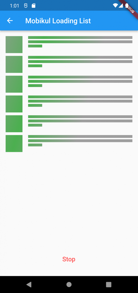
In this article, we are going to discuss about the Shimmer Effects in Flutter which is really an attractive placeholder for loading animation while fetching large amount of content from server or local database to user interface.
Check our Flutter app development services page.
As per our application’s requirement we can change its colour effects, shimmer animation speed, direction accordingly. Here, we will create a simple mobikul shimmer effect application to understand the complete flow of shimmer plugin for a listview.builder widget.

Let’s start implementation of Shimmer effects in flutter application.
1. Project setup:
Create a new flutter project and add latest shimmer library version under dependency in your pubspec.yaml file like following example and run flutter pub get command to install this library in your project.
|
1 2 3 |
dependencies: shimmer: ^2.0.0 |
2. Import package:
Add the following line in your class to import the package.
|
1 |
import ‘package:pull_to_refresh/pull_to_refresh.dart’; |
3. Create your Shimmer effect view:
Now, you can use following code to show the shimmer effects and create a simple simmer effects view in flutter.
|
1 2 3 4 5 6 7 8 9 10 11 12 13 14 15 16 17 18 19 20 21 22 23 24 25 26 27 28 29 30 31 32 33 34 35 36 37 38 39 40 41 42 43 44 45 46 47 48 49 50 51 52 53 54 55 56 57 58 59 60 61 62 63 64 65 66 67 68 69 70 71 72 73 74 75 76 77 78 79 80 81 82 83 84 85 86 87 88 89 90 91 92 93 94 95 96 97 98 99 100 101 102 103 104 105 106 107 108 109 110 111 112 113 114 115 116 117 118 119 120 121 122 123 124 125 126 127 128 129 130 131 132 133 134 135 136 137 138 139 140 141 142 143 |
import 'package:flutter/material.dart'; import 'package:shimmer/shimmer.dart'; void main() => runApp(MyApp()); class MyApp extends StatelessWidget { @override Widget build(BuildContext context) { return MaterialApp( title: 'Shimmer Effect Blog', routes: <String, WidgetBuilder>{ 'loading': (_) => LoadingListPage(), }, theme: ThemeData( primarySwatch: Colors.blue, ), home: MyHomePage(), ); } } class MyHomePage extends StatefulWidget { @override _MyHomePageState createState() => _MyHomePageState(); } class _MyHomePageState extends State<MyHomePage> { @override Widget build(BuildContext context) { return Scaffold( appBar: AppBar( title: const Text('Shimmer Effect Blog'), ), body: Column( children: <Widget>[ ListTile( title: const Text('Mobikul Loading List'), onTap: () => Navigator.of(context).pushNamed('loading'), ), ], ), ); } } class LoadingListPage extends StatefulWidget { @override _LoadingListPageState createState() => _LoadingListPageState(); } class _LoadingListPageState extends State<LoadingListPage> { bool _enabled = true; @override Widget build(BuildContext context) { return Scaffold( appBar: AppBar( title: const Text('Mobikul Loading List'), ), body: Container( width: double.infinity, padding: const EdgeInsets.symmetric(horizontal: 16.0, vertical: 16.0), child: Column( mainAxisSize: MainAxisSize.max, children: <Widget>[ Expanded( child: Shimmer.fromColors( baseColor: Colors.grey, highlightColor: Colors.green, enabled: _enabled, period: const Duration(milliseconds: 1500), direction : ShimmerDirection.ltr, loop: 0, child: ListView.builder( itemBuilder: (_, __) => Padding( padding: const EdgeInsets.only(bottom: 8.0), child: Row( crossAxisAlignment: CrossAxisAlignment.start, children: <Widget>[ Container( width: 48.0, height: 48.0, color: Colors.white, ), const Padding( padding: EdgeInsets.symmetric(horizontal: 8.0), ), Expanded( child: Column( crossAxisAlignment: CrossAxisAlignment.start, children: <Widget>[ Container( width: double.infinity, height: 8.0, color: Colors.white, ), const Padding( padding: EdgeInsets.symmetric(vertical: 2.0), ), Container( width: double.infinity, height: 8.0, color: Colors.white, ), const Padding( padding: EdgeInsets.symmetric(vertical: 2.0), ), Container( width: 40.0, height: 8.0, color: Colors.white, ), ], ), ) ], ), ), itemCount: 6, ), ), ), Padding( padding: const EdgeInsets.symmetric(vertical: 8.0), child: FlatButton( onPressed: () { setState(() { _enabled = !_enabled; }); }, child: Text( _enabled ? 'Stop' : 'Play', style: Theme.of(context).textTheme.button!.copyWith( fontSize: 18.0, color: _enabled ? Colors.redAccent : Colors.green), )), ) ], ), ), ); } } |
4. Control Shimmer Effect
Shimmer widget has following properties which can be used for controlling the shimmer effects in flutter.
|
1 2 3 4 5 6 7 |
baseColor: Colors.<em>grey</em>, highlightColor: Colors.<em>green</em>, enabled: _enabled, period: const Duration(milliseconds: 1500), loop: 0 direction : ShimmerDirection.ltr, child: Widget |
baseColor: Background color of loading effect.
highlightColor: Shimmer effect color.
Enabled: To start or stop the shimmer animation.
period: To control the speed of shimmer animation.
direction: To control the direction of shimmer animation flow(right to left, left to right, top to bottom, bottom to top).
loop: To set the number of animation loop. Set the value to 0 to make the animation run continuously.
child: child property is used to render a widget under shimmer animation.
5. Output:
As a result, you will get the following output as attached video.
Conclusion:
In this article, we have learned shimmer effects in flutter application using shimmer plugin.
Thanks for reading the blog. For more such amazing articles on latest trends in mobile application development please visit our mobikul blog site.
Happy coding 🙂

Be the first to comment.