Hello guys, Today we will learn about the Multiple view inside scroll view with Auto layout.
Before starting we need to know what is Auto Layout?
AutoLayout-
Auto layout is a constant-based layout system, we can also say that it is an adaptive UI that is responsible for the appropriate change in screen size according to device orientation.
without using auto layout, it would be very difficult to create an app screen that supports all screen resolution
Multiple views inside scroll view:-
For better understanding let’s take an example of multiple views inside a scroll view
Step 1:-
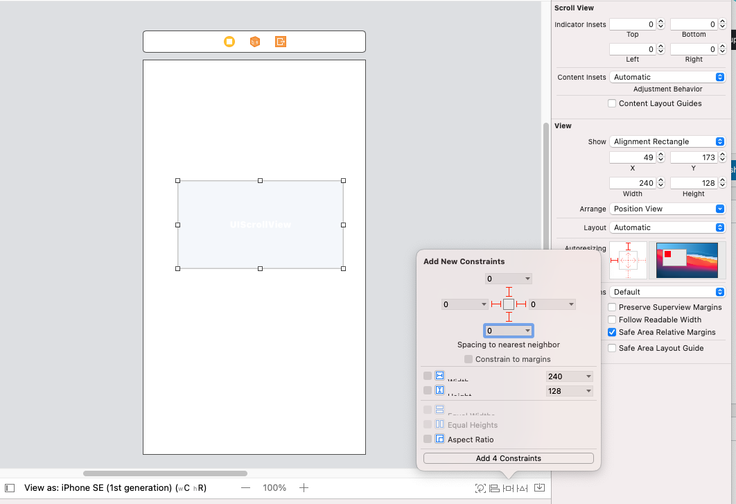
Take a scroll view in the view controller and set a leading trailing top and bottom constraint to (0), uncheck constrain content Layout Guides.
Step 2:-
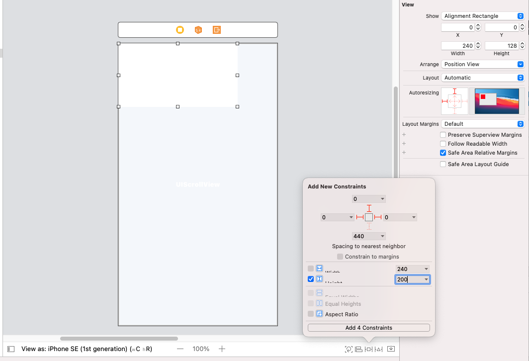
Now, take a view inside scroll view and set trailing, leading or bottom to (0) and set Height (200) and equal width to scroll view
Step 4:- Now, take scroll view inside view and set constraint to top, bottom, leading trailing to (0,0,0,0)
Step 5:- take view inside scroll view and set constraint to top, bottom, leading trailing to (0,0,0,0) and take label inside view and set margins to top, trailing, leading and height >= 0
For more view follow step 2 to step 5, your screen looks like –
After adding all the views, we define the view in the storyboard with constraint 
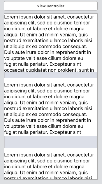
Run the app and see your view is look like this –
Conclusion –
In this blog, we have discussed Multiple views inside scroll view with Auto layout working
I hope this blog will help you in getting some basic knowledge about the Multiple views inside scroll view with the Auto layout.
Thanks for reading!


Be the first to comment.