Charts in Flutter are required for the Graphical Representation of the data, making it easier for the users to understand the data and analyze it.
Basically, Charts are easy to read in comparison to reading a huge set of data.
You may also check our Flutter app development company.
Here are some types of charts-
- Bar Chart
- Line Chart
- Pie Chart
- Scatter Plot Chart
- Time Series Chart
Implementation of Charts in Flutter
Firstly, you will have to add the charts_flutter dependency in pubspec.yaml file of our project.
In order to get the updated version of the dependency, you can check pub.dev.
|
1 |
charts_flutter: ^0.10.0 |
Now, Run the pub get command, to include it in the project.
Bar Chart
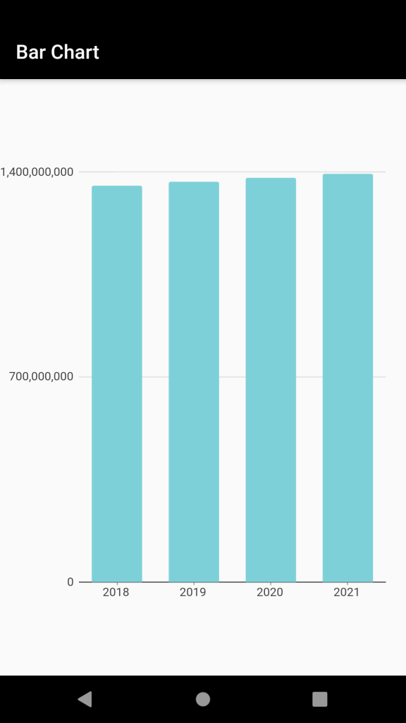
A Bar Chart is a way of representing data through rectangular bars and it is also used to make the chart in either Horizontal or Vertical Direction.
By default, Bar Chart is created in Vertical Direction.
|
1 2 3 4 5 6 7 8 9 10 11 12 13 14 15 16 17 18 19 20 21 22 23 24 25 26 27 28 29 30 31 32 33 34 35 36 37 38 39 40 41 42 43 44 45 46 47 48 49 |
class MyHomePage extends StatelessWidget { final List<charts.Series> seriesList; const MyHomePage({Key key, this.seriesList}) : super(key: key); List<charts.Series<Population, String>> _populationDataSet() { final data = [ new Population('2018', 1352642280), new Population('2019', 1366417754), new Population('2020', 1380004385), new Population('2021', 1393409038), ]; return [ new charts.Series<Population, String>( id: 'Population of India', colorFn: (_, __) => charts.Color.fromHex(code: "#7DD0D7"), domainFn: (Population sales, _) => sales.year, measureFn: (Population sales, _) => sales.population, data: data, ) ]; } @override Widget build(BuildContext context) { MyHomePage(seriesList: seriesList); return Scaffold( appBar: AppBar( backgroundColor: Colors.black, title: Text("Bar Chart"), ), body: Center( child: Container( width: MediaQuery.of(context).size.width, height: MediaQuery.of(context).size.height / 1.5, child: charts.BarChart( _populationDataSet(), )), )); } } class Population { final String year; final int population; Population(this.year, this.population); } |
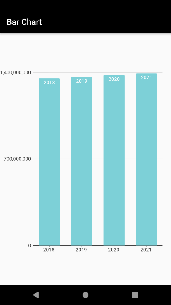
If order to add labels, within our rectangular bars, we can add a property named ‘barRendererDecorator’.
|
1 |
barRendererDecorator: new charts.BarLabelDecorator<String>() |
To make the Horizontal Bar Chart, you can set the vertical property to ‘false’.
Line Chart
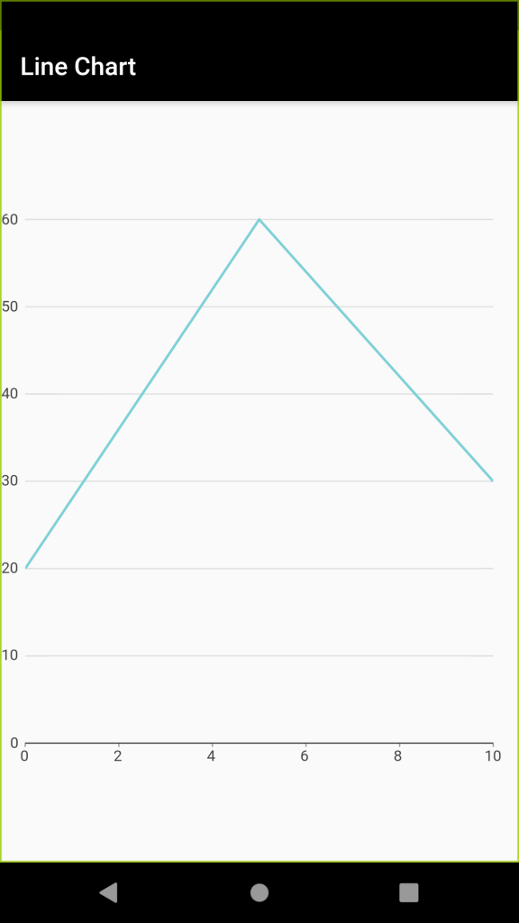
Line Chart is one which represents the data in the form of lines.
|
1 2 3 4 5 6 |
Container( width: MediaQuery.of(context).size.width, height: MediaQuery.of(context).size.height / 1.5, child: charts.LineChart( _populationDataSet(), )), |
Pie Chart
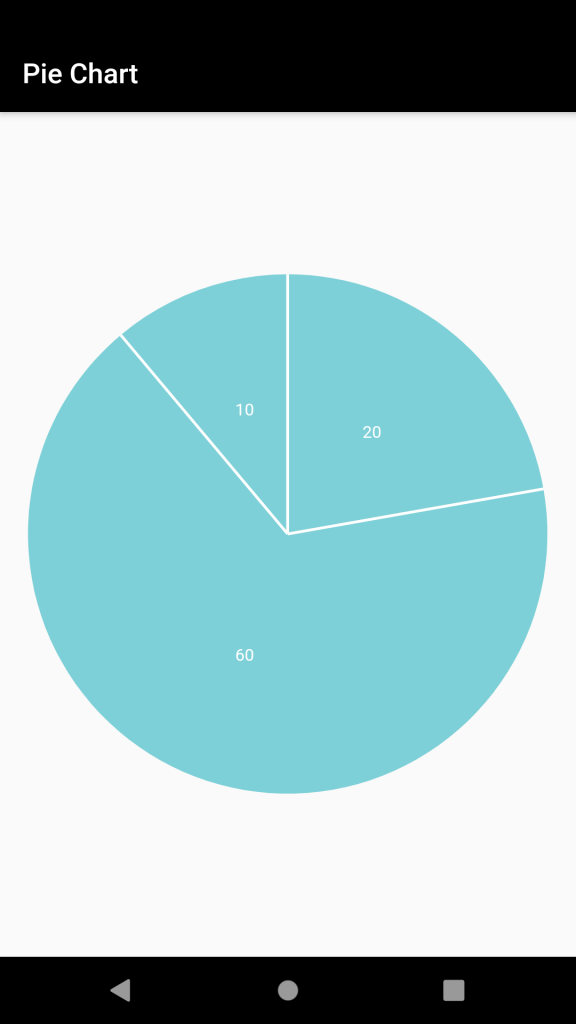
A pie chart is a chart that is circular in shape and is divided into multiple sections based on the percentage.
|
1 2 3 4 5 6 7 8 9 10 11 |
Container( width: MediaQuery.of(context).size.width, height: MediaQuery.of(context).size.height / 1.5, child: charts.PieChart( _populationDataSet(), defaultRenderer: charts.ArcRendererConfig(arcRendererDecorators: [ charts.ArcLabelDecorator( labelPosition: charts.ArcLabelPosition.inside) ]) )), |
To add the labels in the Pie Chart, we can use the ‘labelPosition’ property of ‘defaultRenderer’.
You can even choose to add your labels inside or outside the Pie Chart as per your requirement.
Therefore, in this way, you can create different types of charts as per your requirement in the Flutter Application.
Conclusion
In this blog, we have read about the Charts in Flutter.
I hope it will help you out in understanding and get a brief idea about it.
Here are some of the other blogs you can check – https://mobikul.com/blog/
Thank you for reading!!


Be the first to comment.