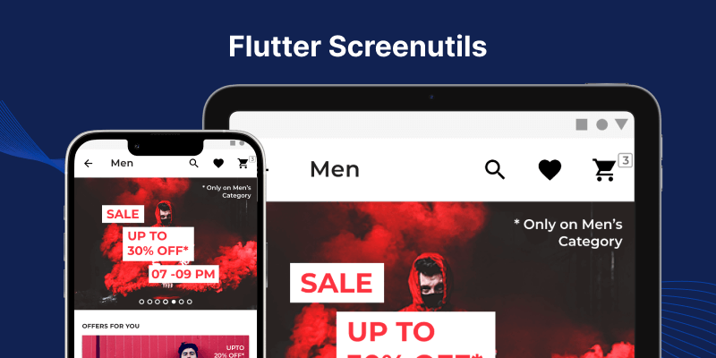
In the realm of Flutter development, creating applications that adapt seamlessly to various screen sizes and resolutions is crucial for providing users with an optimal experience.
Fortunately, Flutter offers a range of packages to simplify the process of building responsive user interfaces, and one such gem is the “flutter_screenutil” package.
In this blog, we’ll take a deep dive into the capabilities of the “flutter_screenutil” package and how it empowers developers to streamline responsive UI development in Flutter.
Before we dive into the code, you can also check our Flutter app development company page.
What is the “flutter_screenutil” package?
The “flutter_screenutil” package is a powerful tool designed to assist Flutter developers in creating responsive layouts that scale gracefully across different devices and screen sizes.
It provides a set of utilities and methods to handle screen size and pixel density, allowing developers to design UIs that look great on devices of all shapes and sizes without the need for complex calculations or manual adjustments.
Getting Started with “flutter_screenutil”
Integrating the “flutter_screenutil” package into your Flutter project is a breeze. Simply add the package to your “pubspec.yaml” file.
|
1 2 3 4 |
dependencies: flutter: sdk: flutter flutter_screenutil: ^5.9.0 |
After adding the package to your project, import it into your Dart files:
|
1 |
import 'package:flutter_screenutil/flutter_screenutil.dart'; |
Key Features and Utilities
- Screen Adaption
One of the standout features of the “flutter_screenutil” package is its ability to adapt UI elements based on the device’s screen size and pixel density. Developers can specify dimensions and font sizes in a unit called “screen width percentage” ( “w ” ) and “screen height percentage” ( “h” ), allowing for consistent scaling across different devices. - Pixel Density Handling
Pixel Density variations across devices can impact the visual quality of your UI. ScreenUtils handles pixel density scaling, ensuring consistent rendering across different screens, - Orientation Support
ScreenUtil detects device orientation changes, allowing your UI to adapt dynamically. Whether it’s portrait or landscape mode, your app will provide a consistent experience.
Example Usage
|
1 2 3 4 5 6 7 8 9 10 11 12 13 14 15 16 17 18 19 20 21 22 23 |
import 'package:flutter/material.dart'; import 'package:flutter_screenutil/flutter_screenutil.dart'; class TestClass extends StatelessWidget { const TestClass({Key? key}) : super(key: key); @override Widget build(BuildContext context) { ScreenUtil.init(context); return Scaffold( body: Center( child: Container( width: 300.w, /// 300 logical pixel width height: 200.h, /// 200 logical pixel height child: Text( "Hello World!!!", style: TextStyle(fontSize: 20.sp), ///20, logical pixel font size )), )); } } |
Conclusion
With Flutter’s ScreenUtils package, responsive UI development becomes a breeze. Simplify your development process, achieve consistency across devices, and deliver a seamless user experience with screenUtils.
To know more about the package please visit here.
Thanks for reading. You can also check other blogs from here. Happy coding.